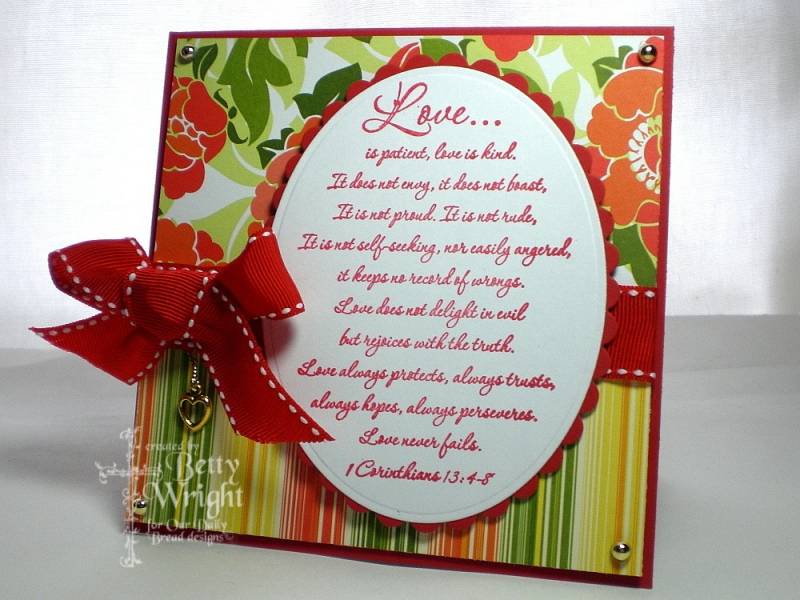
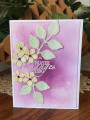
This card is for a few challenges. First, it is for today's LSC215. Triple Play! Thanks so much Wendy for a fabulous challenge. This card is also for the monthly Divine Design Bible Verse Challenge. I am also doing Sharon(notimetostamp) "hang it up" challenge. I have a dangling heart charm I added to my card. Thanks for another fun challenge, Sharon!!!
For the triple play...LSC challenge. I used two pieces of dp one at the top and one at the bottom....one layer....and I layered the oval nesties....two layers for a total of three layers. My oval scripture, ribbon, and charm are my three focal points. I used red, yellow, and green as my three colors which are in the dp.....and white as my neutral. The card base is the free layer.
I am using ODBD newly release 1 Corinthians 13. I love this scripture. I am using some dp I purchased online several months ago. It is by Scenic Route and it is very bold and bright. I have been hesitating to use it because it is so bright.
After I finished my card, took the picture, and edited it, I decided my card needed a new look. SAME card TWO looks...so to speak. Here is the blog post showing both looks Stamping to the Wright
STAMPS
ODBD 1 Corinthians 13
PAPER
PTI poppy, Scenic Route dp, gp white
INK
Real red
ACCESSORIES
ribbon, heart charm, gold pearl/domes
Date: Friday, April 10, 2009 GMT Views: 789
Favorited:15
Registered: December 8, 2006 Location: currently stationed in Norman Oklahoma Posts: 11275
Fri, Apr 10, 2009 @ 11:33 AM
WOW! I love your creation here. Very pretty!
------------------------------ Bonnie~Proud Fan Club Member~Marine Wife My Gallery~One of Kota's Kids My Blog~Bonnie's Creative Corner Every Job is a Self-Portrait of the Person Who Did It. Autograph Your Work With Excellence.~Author Unknown
Registered: April 20, 2006 Location: Michigan's Upper Peninsula Posts: 34762
Fri, Apr 10, 2009 @ 11:40 AM
What a pretty card! I LOVE that verse, the dangling charm is just adorable, and I love your fun and vivid papers/colors!!! So honored you included my challenge among the rest - thank you so much!!!
Splitcoast Dirty Dozen Alumni SCS Gallery Moderator Splitcoast Challenge Hostess Teapot Tuesday TEAm
Registered: July 27, 2007 Location: Dublin, Ireland Posts: 132007
Fri, Apr 10, 2009 @ 12:07 PM
Well I can say I prefer this one, but I was never very big into distressing. I don't use a lot of bright colours, either, (I like them, just find them hard to use) but the citrus freshness in those papers is a breath of fresh air.
Registered: November 3, 2005 Location: Fairport Harbor, OH-IO, Lake Erie shoreline Posts: 60343
Fri, Apr 10, 2009 @ 12:55 PM
First I went to your blog to see the other. I like this one a lot b/c of it's brightness, but I also like the muted effect of the distress inking. I'm really not into distressing my cards, so I hardly ever do that. I think I like this one better. I LOVE this scripture and I think it's outstanding in the red. Awesome work.
------------------------------ Karen ~ Thanks for stopping by my gallery. Proud Fan Club Member - FS525, QFTD49 Life is better in a beach town!