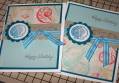
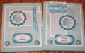
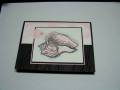
I had some problems with placement because my Circle layer wasnt as large. I like them both very much but the one with one ribbon strip seems a bit more in balance. Thank you "card crazy" for the inspiration.
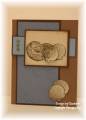
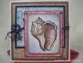
FYI I used Papier (like the SU Crystal Effects) on the shell after I embossed it with Teal Colorbox so that it gave it some "pop" power. I also started with white brads and used the Teal Colorbox on them with the teal embossing powder that I have. I stamped the shell on the DP background paper also to tie it in. I made six cards and each is a little different as I dtried some different ribbon and placement.
Date: Sunday, February 8, 2009 GMT Views: 984
Favorited:9
Registered: October 13, 2006 Location: North Attleboro, MA Posts: 7486
Sun, Feb 08, 2009 @ 8:37 AM
I agree, these colors are beautiful. I'm flattered that I was able to inspire you to make such a gorgeous creation. I really like how you switched the layout to make it your own. Awesome job here!
Splitcoast Dirty Dozen Alumni Creative Crew SU Design Team Alumni
Registered: October 29, 2004 Location: Coos Bay, Oregon Posts: 24007
Sun, Feb 08, 2009 @ 1:08 PM
I really like how you colored and glazed your brads. Your colors and placement layouts look great. Six cards.....wow, you are a stamping dynamo :-) TFS P.S. Your new photo's make your cards even prettier. TFS
Registered: August 10, 2008 Location: In my stamp room, stamping, painting, and gluing... with the dogs playing under my feet.... Posts: 2848
Sat, Mar 21, 2009 @ 11:54 AM
This is so beautiful. All the little details add so much... the brads, how they're matted, stamping over the dp... that's one of my favorite things to do ;). It all came together so beautifully!
------------------------------ Cathy at the Seaside Rose Cottage