Page base is Ballet Blue sponged with Whisper White craft ink to give it a little bit of texture, it's pretty subtle even IRL. Accent colors are Summer Sun and Real Red, and I used those ink colors for the flowers from Eastern Blooms (so glad my friend Amber talked me into that set!).
I started out with the sketch on p. 178 of Best of Becky Higgins' Sketches, but it's tweaked so much that it doesn't look a whole lot like the original sketch. I like how the layout turned out though, I worried a bit that the blue, red, yellow color combo would be too Clark Kent-ish
Date: Friday, January 2, 2009 GMT Views: 261
Favorited:3
Registered: November 16, 2005 Location: Glendale, AZ Posts: 26620
Fri, Jan 02, 2009 @ 8:09 AM
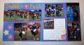
Clark Kent didn't come to mind at all when I saw these pages! These are wonderful and rich. Love the bright yellow title and the flowers--and the placement of the two photos at the bottom of the left page really pick up the sense of movement in the photos.
Nice to see you here--I remember you from the cardmaking side of SCS (where I haven't been too much since I got back into scrapbooking!)
------------------------------ Wendy B in Sunny AZ
Registered: October 29, 2007 Location: Lacombe, Alberta Posts: 3173
Fri, Jan 02, 2009 @ 8:47 AM
Nice pages. Such brightness. tfs
------------------------------ Deb
My Avatar: my "before" photo 2010 pages 218/120; 2011 pages Jan 5/10; Feb 4/10; Mar 16/10; Apr 31/10; May 29/10; JUN 15/10; YTD 100/120 My Gallery
Registered: March 13, 2006 Location: on a street. in a city. in a country Posts: 1210
Sat, Jan 03, 2009 @ 11:29 AM
great pages!!!!
------------------------------
plan {Pea}
scrapbook challenge 2011**ytd 0/60**
if at first you don't succeed...cover it with cardstock and keep going!
scrapbook page goal for 2011-1/24
august 1/2
٩(●̮̮̃�̃)۶


 To read more about the festival, see this blog post: