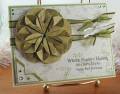
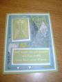
Thanks for a great challenge Marin. This is all about the matching, the first (left) has green sponged on spotlight, but it doesn't match DP, also decided it was better in Browns. The white space in the first was too big and the spotlight too high, so moved the spotlight down, added sentiment, and then sponged olive around spotlight, and DP. I used markers to make the brads match better.
Date: Sunday, November 16, 2008 GMT Views: 324
Favorited:3
Registered: April 3, 2008 Location: Golden Gopher country Posts: 3469
Sun, Dec 07, 2008 @ 12:51 PM
Hard to say that this original needed a redo, but you absolutely "improved" on each feature you mentioned. Both cards are stunning. I like your style!
------------------------------ Sarah/Mrs (R) "You want to be more careful. Hanging around like this, people will think you're up to something." Severus Snape Superglew! Blogs