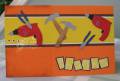
My personal goal for today was to use Natural Beauty. I decided to make mine a square card. And I think that the DP colors were too close. And, when I cuttlebugged the red one, the embossing showed up a bit white. But just more texture, right? The base is on Handsome Hunter...which doesn't look green in the pix!
Date: Wednesday, November 5, 2008 GMT Views: 1848
Favorited:14
Splitcoast Dirty Dozen Alumni SCS Gallery Moderator Splitcoast Challenge Hostess Teapot Tuesday TEAm
Registered: July 27, 2007 Location: Dublin, Ireland Posts: 132007
Wed, Nov 05, 2008 @ 2:04 PM
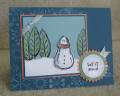
Now that is really lovely. The stamped images with just that light touch of glitter are great, and personally I really like the way the embossing came out on the solid panel - a great distressed effect which goes so well with the BG.