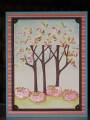
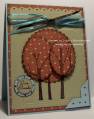
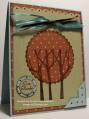
I just was not happy with my card yesterday so here is the updated version. Like it better but now think the tree on the right should have been a circle instead of an oval. Oh well, it's all practice right? Which one do you think is best? Here is a link to the first one:
Registered: April 20, 2005 Location: The only Eaton Rapids on the Earth, Michigan Posts: 57568
Sun, Oct 05, 2008 @ 10:55 AM
Both of your cards are very cute and pretty, Sandee. I like this one the best because of the layering you did with the ovals. What a great idea for this image!
Registered: April 16, 2006 Location: Stamping with friends when I can Posts: 17694
Sun, Oct 05, 2008 @ 11:47 AM
THat is an improvement over a great idea. I have to say, that is what I thought it needed when I saw your first card. Might be fun to use different colors of DP for the different circles. TFS