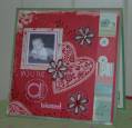
When I first bought this set while I did love it, I was not sure what in the world I was going to come up with. But, have found that I have started to really enjoy working with it.
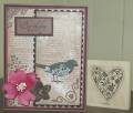
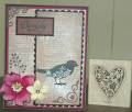
I know that the well worn words looks like it is stamped with close to cocoa, but it's not, it's actually versamark vintage sepia. In real life it actually looks almost bronzy/brown. It does look very effective in the flesh. I couldn't decide whether I preferred the yellow or chocolate flower accent teamed with the pink? I wonder what you think?
Date: Friday, September 19, 2008 GMT Views: 564
Favorited:5