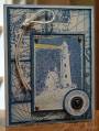
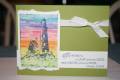
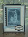
I just received this set and had to play. I used shimmer white for my main image, hard to see in the photo. I've seen the use of strips of paper the same color used to add depth, so I tore 3 strips of baja breeze to use behind my main image. It needed a bit more, so I sponged them. Then when I stamped the words at the bottom, again it needed more, so I stamped again and cut out words to make them stand out
Date: Tuesday, September 16, 2008 GMT Views: 842
Favorited:3
Registered: October 12, 2007 Location: Arizona Posts: 70346
Sun, Jan 04, 2009 @ 2:11 PM
Just saw this card and I like it. The paper tearing behind the main imagine is such a nice tough for this stamp. Good idea! The individual words in white really does make the verse stand out. Again, good idea! Thanks for sharing.