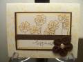
Basically, create a 6 x 6 page, then make the 6 x 6 page a 8.5 x 11, then make the 8.5 x 11 a 12 x 12.
It gets you thinking about how to put the focal stuff on the 6 x 6, then embellish with supporting characters.
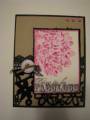
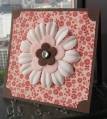
The cameo coral 6 x 6 in the top right corner. that's the first part...the 6 x 6.
Then the river rock - that's the 8.5 x 11. The added piece to that was the rectangle at the bottom with the ribbon.
Then I added the 12 x 12 DP. I put the paper strip on and the third picture. To make it interesting, I put part of the third picture under the rectangle on the 8.5 x 11.
Whatcha think?
Date: Saturday, August 30, 2008 GMT Views: 1965
Favorited:7
Registered: February 15, 2008 Location: Wisconsin Posts: 6159
Sat, Aug 30, 2008 @ 5:41 AM
I don't understand what a progressive page is. I never heard that term before, can you pm me and let me know what it means? Anyhow, nice page. I love the colors and the dp.
Registered: November 16, 2005 Location: Glendale, AZ Posts: 26620
Sun, Aug 31, 2008 @ 8:24 PM
This is a terrific page. You coordinated the dp so beautifully with the photos. I just love that Tidy Alphabet set from SU. I own it too and I think it's time to bust it out for a layout soon!
------------------------------ Wendy B in Sunny AZ
Registered: September 22, 2007 Location: Edmonton, Alberta Posts: 10
Tue, Sep 09, 2008 @ 9:40 AM
I really love the colours and the layout. I like how it doesn't look obviously progressive (it's not choppy), but that you can tell which part is which if you are looking for them. Everything is so well coordinated, that the ensemble is terrific. Thanks for sharing!
Registered: July 14, 2004 Location: Living imperfectly with great delight! AB, Canada Posts: 3325
Sat, Aug 29, 2009 @ 3:35 PM
Fun and beautiful! Neat to see how it transforms! Really adds layers, doesn't it!
------------------------------ Smiles and laughter, Laurie
Finally I have a Blog..come visit and lend me a hand decorating with some of the nifty sidebar thingys! LOL http://www.actofstamping.blogspot.com/