Splitcoaststampers.com - the world's #1 papercrafting community
You're currently viewing Splitcoaststampers as a GUEST. We pride ourselves on being great hosts, but guests have limited access to some of our incredible artwork, our lively forums and other super cool features of the site! You can join our incredible papercrafting community at NO COST. So what are you waiting for?
I give up. Stampin' Up! hasn't made a light gray. Smoky Slate is a movement in the right direction, but not there yet. I want something lighter.
I know it's popular, and I seem to see that several companies stock a light gray. Can you head me in the right direction? Will you share where you get that really light gray paper...and ink if they have it...with a link? I'd really appreciate it.
I want a light gray option in my collection of standard card bases. Right now I have Neenah Classic Crest in Solar White and Classic Natural White (almost exactly the SU vanilla), Recollections Black, SU Crumb Cake, and a linen textured art paper I use for card bases. It's great having a file of basic card bases right at hand. But there's a hole for gray! :rolleyes:
Have the Going Gray inkpad and reinker, but no marker or cs. Haven't bought any of SU's other or newer gray inks, although I do have the newer markers. I agree that Smoky Slate is a step in the right direction. If they went back to 12 colors in their color families they could fill in a few missing colors.
It is very light. But I always thought it looked like dirty dishwater, and it's one color I vowed I would never, ever reorder. LOL.
(In fairness, it might have just been the patterned paper I paired it with. It was for a local swap, so I couldn't change it by the time I was making it, and then I had to make 12 of the same card, so I KEPT looking at it.)
That's funny! Maybe you had a bad batch. I'll try to post some photos. It's one of my Go To card bases, and it pairs so well with so many patterned papers (especially my favorites from Lawn Fawn!).
So, I looked at the SSS fog. Found that it is what Debby Hughes (limedoodle) uses...and it's LOVELY. She used it on this card (among many others!) And Michelle Short used the SSS fog on this card. Ooh, I like!
Karen Giron (karengiron) made a couple of adorable cards here and here with MFT grout gray.
Michelle Short made a lovely card with PTI soft stone here and Iwona Palamountain made one here.
Those are all about the type of light gray I want. I will be checking them out...probably the MFT and SSS since I don't much care for PTI.
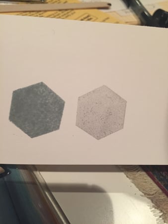
Lydia...I remembered I had a sheet or two of soft stone from a while back. Putting it next to Soft Slate it looks like a slightly off white. Putting it next to white though, it is definitely gray. So it is about 20 shades lighter than Smoky Slate.
BTW. Smoky Slate is a cool gray, while Going Gray is a warm gray (and I love it and hoard it!) that is a couple of shades darker than Smoky Slate.
It is very light. But I always thought it looked like dirty dishwater, and it's one color I vowed I would never, ever reorder. LOL.
I agree with you as to what it looks like. Unless you put it with white. Then it looks lovely. I'll have to look in daylight to see what the undertones are.
Gray is a fickle color, as it can have undertones of brown, blue, green, even lavender. You have to be careful. That's why there are so many gray markers...French Gray, Light Gray, Cool Gray. Warm Gray, etc.
Gray is still the trend in home furnishings and decorating, but you have to be so careful when picking a color. You can end up with something warm and inviting or something cold and sterile as an operating room.
All of this to say...it may be a matter of personal preference, and you will probably have to hold it in your hand to be sure.
Yes, I know I will have to get some in my hand. I looked at Soft Stone (PTI) in daylight, and it has the brown undertones. Looks wonderful as a third shade with Sahara Sand and Tip Top Taupe. But it's not quite a french gray...or a warm gray either. Way too many ways gray can go!
I am with you, Mary Rose, on the trends in decorating. My daughter calls the color she painted "greige"...but it's a little too much on the gray side for me. I like just a little warmer. But it does look nice! Particularly with white, espresso brown, and green accents. Rich!
Hmm. I just made a discovery. I got out my sample book of Neenah Classic Crest. They have an Antique Gray. I had forgotten that they made the gray as well.
But my discovery...? PTI soft stone is the same color as Neenah Classic Crest Antique Gray. No difference whatever. Food for thought. Actually I think I'll be visiting my friendly paper store to see if they can order single packages of 250 in several colors and textures for me.
I think I'll still check out the SSS and MFT papers first though.