Splitcoaststampers.com - the world's #1 papercrafting community
You're currently viewing Splitcoaststampers as a GUEST. We pride ourselves on being great hosts, but guests have limited access to some of our incredible artwork, our lively forums and other super cool features of the site! You can join our incredible papercrafting community at NO COST. So what are you waiting for?
Has anyone tried Arteza - Metalic Water Colors? Or any other metalic water colors? Are they as good as they look in the online videos? What do you use them for? Just for highlighting or overall painting? Does anyone have any card photos they can share?
__________________ Louise Bergmann DuMontAuthor, Speaker, Serious About Her Coffee, Lover of all that is Chocolate...Worshiper of El Shaddai (The All Sufficient One)
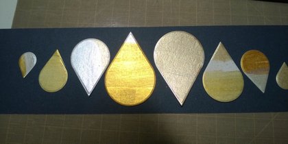
I don’t think the photo shows them very well, but one is attached. Old phone = bad photo. They used to be called Finetec, now Coliro but they’re the same German paints. Almost 500 5-star ratings.
I have another set with colors but don’t remember the name. I’ll try to remember to pull it out tomorrow, but if I don’t, feel free to PM me to nudge me.
You are lucky...there seems to be this blossoming of metallics....which I love bc I love metallics. It is always the first colors I get in a collection.
There are WC metallics like BJeans mentioned-those are a very nice series.
There are water based metallic acrylics- so you can paint with them-I just got in deco art Extreme sheens and love the diversity of the metals on my samples. (not just silver, gold, copper)
There are WC inks now in bottles-I got gold, silver, copper and bronze from Hero-they are all ok...the silver is dull, but I am loving the bronze-it is a very dark and rich brown compared to other bronzes in my collection.
Brutus monroe has aqua pigments...
and so on.
Are you looking for colors in the metallics? Then I might look to the extreme sheens. Not tons of colors but what they have are nice and they are mixable to make more colors.
I have been disappointed in the colors that call themselves metallics. ie Finnabair art alchemy dark velvet-a lovely dark purple but not metallic. On the other hand their magical pond is a very nice aqua metallic as is their vintage rose. So to me it is a little hit and miss.
Thank you everyone for your input. Now to decide what to do. LOL
__________________ Louise Bergmann DuMontAuthor, Speaker, Serious About Her Coffee, Lover of all that is Chocolate...Worshiper of El Shaddai (The All Sufficient One)
There ARE other sets out there. I believe the set that bjeans is recommending is by Finetic & YES, it is NICE!!! Although, I haven't tried it, but seen what others do with it. I think it is the top of the line??? Am I right bjeans???
I’m not a paint expert and think your ideas are terrific. The LSS I mentioned above did switch from Kuratake Starry Nights to Finetec/Coliro after we got to compare. (We happened to be there for an Oxide techniques class.) Not that the Kuratake wasn’t nice - it is. But side by side with the Finetec there was a difference.
I forgot to look at the colored metallics - I haven’t been in my craft room for days, sorry.
My favorite is the Paul Rubens metallic watercolors. Altenew's new metallic are also very nice but I've only had them a couple of weeks and the tin is starting to rust, paint is great tho. Artsy is not quite as good as PR but pretty close. The new Arteza metallic are more like their metallic gouache, more pearl than metallic.
I have a comparison with photos of swatches on my blog the frugal crafter (search metallic watercolor showdown) to see other brands too. I'm not crazy for having all of these, I do art product reviews on my YouTube channel (OK, maybe I am a little crazy LOL!)
The multi-colored metallics are a 12 color set by Prima, called Art Philosophy Metallic Accents. They call them semi-watercolors. I just swatched them but can't get a decent photo. Some of the colors are wonderful - turquoise, a green I didn't like until it dried. Even a rich charcoal.
Side by side with Finetec, which I just swatched, there's a difference.The Prima has what I might call minuscule metallic sparkles, other than the dark gray. The Finetec is more like real metal, flatter, if that makes sense. (I'm not describing it well.) If you look at a gold ring or brass fixture, they'll have a shine but not sparkles. The dark gray Prima is more like the golds in the Finetec set. BTW, some of the Finetec golds are similar to each other.
And of course they can be used like any watercolors for regular painting. The water to paint ratio is important. Add a little water, mix well with the brush - takes a bit of time to get a rich brush full of color. Just my take. YMMV. Sorry I'm so late on this.
ETA! TLady mentioned the Prima! Sorry! And to get a more pigmented, colorful brush full of paint, I think spending time really allowing the paint to absorb the water and mixing well is key.
What great information and suggestions. Thank you everyone.
__________________ Louise Bergmann DuMontAuthor, Speaker, Serious About Her Coffee, Lover of all that is Chocolate...Worshiper of El Shaddai (The All Sufficient One)
I have the Prima set, and now have black watercolor paper. I'm going to try making metallic watercolor paints using Pearl Ex, Gum Arabic and distilled water.
4 parts Pearl Ex, I part Gum Arabic, 2 parts water. Or add more water to make calligraphy ink for a dip pen.
__________________ Linda E
Caution: You are entering an artistic zone. This is not clutter - this is creating. These are not pajamas - it's my work uniform.
I've had the Gansai Tambi Starry Colors & their pearlescent colors (forget the exact name of those offhand). The Starry colors are very metallic, & work especially well for splatters, which is what I mainly use them for. I think the pearlescent ones would show up better on black cardstock, though I haven't tried that yet. They don't do well on white. The main reason I went with those was they were cheaper than the FineTec. But, last Christmas my mom got me the full set of FineTec Pearlescent watercolors. They are amazing! They have 2 colors in the set that are supposed to be like interference/duo colors, which change color as you look at them from different angles. I don't see it, though. Anyway, they work OK on white, though I think the colors really come through on black. I don't have black watercolor paper, so I just apply a coat of Daniel Smith transparent watercolor ground to heavyweight black cardstock & use that. Keep in mind, if you go that route, you do have to let the ground dry for 24-48 hours, so it's not a last-minute project type of supply. I think the 24 hours should suffice for cardstock. Also, if you apply the ground too thickly, it will show up as kind of milky (ask me how I know! LOL). You could use them on black cardstock without priming with the ground, but I would not add much water--maybe more like just accents here & there--so as not to pill the paper. Anyway, I know Kristina Werner uses the FineTec, hence my decision to ask for them finally. They are not cheap, but I don't use much at a time, so they should last a good long time. I did make a card where I painted a poinsettia on black with them, but if I posted it anywhere, I can't find it now! :( Anyway, hope this helps!
Thank you everyone. The advice and information was very helpful.
__________________ Louise Bergmann DuMontAuthor, Speaker, Serious About Her Coffee, Lover of all that is Chocolate...Worshiper of El Shaddai (The All Sufficient One)