Splitcoaststampers.com - the world's #1 papercrafting community
You're currently viewing Splitcoaststampers as a GUEST. We pride ourselves on being great hosts, but guests have limited access to some of our incredible artwork, our lively forums and other super cool features of the site! You can join our incredible papercrafting community at NO COST. So what are you waiting for?
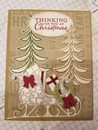
I am finally getting to my Christmas Cards. This is what I came up with so far. Nothing is taped together yet as I am not sure I absolutely like it. What changes would you make? I am totally up for suggestions.
Thank you for taking the time to look. Sorry its sideways, dont know how to fix that.
__________________ Sheri
Still collecting and organizing!
That’s cute I find myself looking for a little sparkle though; could you use some dazzling diamonds or something, maybe on the sleigh? Or painted on the tree branches.
I love the two different colored trees. I might play with it by making the light colored tree shorter - either taking off the top two or three levels/branches or taking the bottom off and lowering it, to give a feeling of distance, and instead of an enclosed rectangle the eye would go from the sentiment down the tree, across the sleigh and up a bit. That might mean putting the green tree in front of the sentiment? Clear as mud, right? : ) And do feel free to ignore me.
Oh, love the silver glimmer paper!
Beth
Last edited by bjeans; 10-29-2017 at 05:14 PM..
Reason: Clarifying
Totally fun card! Fine as it is, however, if you are willing to experiment, you might try moving the sentiment, to tighten up the design.
The magic �rule of thirds� suggests that the sweet spot for design elements is on the lines that mark a space into thrips, horizontally and vertically.
Right now your sled is �in the zone� - all good! The sentiment is perched above, anchoring the two trees together, however it so high on the card that it draws the eye away from that fabulous sleigh filled with packages. You might try tucking the sentiment into the sleigh so it looks like it is one of the gifts....doing this might require you to scoot the right tree closer to the left tree which would open a space for the sentiment to have breathing space in the sleigh. (Doing this would also reveal that really cool background that you made that is hidden by the placement of the sentiment and the trees.
Of course, these suggestions could end up looking yucky! ;-) One thing I�ve picked up from �the cool kids� here on SCS: you have to be open to totally rearranging your card design and even eliminating elements to allow the best part of your design to be the main focus of the card.
I admire you for being brave enough to ask for suggestions! Your card is awesome as it is, so don�t think that my comments are finding fault. I only hope to share some insight that I�ve picked up from the fabulous talent here on SCS.
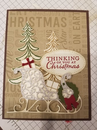
Thank you I will try that. I am so open for suggestions!
I love the vintage feel of your card. I think it might look good with darker brown sponging around the edges or maybe a dark colored layer barely peeking out under the designer paper.
I also like Patrice's idea of the seed beads for the wreath.
The card is great, but you might want to try turning the card on the side and have the trees on the left (they would need to be cropped down) and the sleigh covering part of the trees (maybe pop the sleigh up on dimensionals) and there should be room for the sentiment on the right side maybe closer to the bottom. Or maybe no sentiment on the outside. Just a thought!
I would move the tan tree over closer to the middle. Slide it down behind the packages but cut the bottom off so you can’t see it below the sleigh. I would probably let the green tree branches be on top where they overlap. Other than that change, I really like it!
Cue-ing off of Susy's mention of the "rule of thirds", my take on a layout would be this:
...Raise the sleigh a little bit off the bottom. It needs some foreground.
...Place both trees overlapping each other towards the left, with left tree top higher than the right. They will be behind the main body of the sleigh and generally placed on the left third line.
...Place the sentiment in the top right "sweet spot"--on that upper right intersection of two third lines. The sentiment should also slightly overlap the tree branches in that area
What will this accomplish? When you view any card/photo/painting, the goal is to draw the viewer's eye through your composition quickly to a focal point. Here, you would begin at the sleigh in the lower right, flow quickly back the sleigh and up the trees and around to the sentiment, where they would stop and focus.
I agree about the trees, I think they are too tall and need to be cropped and overlapped a bit, put on the left and the sentiment a bit lower and to the right. I would only have one bow,the one on the wreath, and if you don't have seed beads, red stickles would work. I love the background and the sleigh!
I think I would make the wreath darker or color in those leaves as well as maybe a few red "berries" of some sort. Can't wait to see what you end up with
ok , wow what great ideas. I think I am getting closer. Darker Base, check, darker wreath check, still need berries. Lowered sentiment, raised sleigh, moved trees closer.Am I getting close???
__________________ Sheri
Still collecting and organizing!
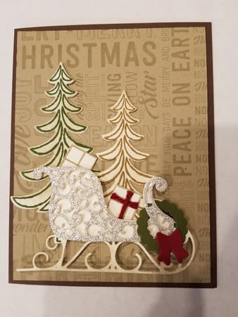
You were close with your very first version, and anyone would have been thrilled to get that first version! It's just interesting and fun to play and I appreciate your inviting us.
I actually like the sentiment a bit higher, rather than dropping it down so low. Right now it's bisecting the card about half way down, and going back to the rule of thirds, I might bring it up to the imaginary upper third line. Your sleigh is gorgeous and doesn't want to be crowded? : ) (There are many more design principles than thirds but it's a really nice and quick check.) I'd probably put the sentiment up and behind the white tree, with the white tree carefully positioned to not cover the letters.
I actually prefer your original version. I think your latest version makes it look like everything is squished together. You can’t see how adorable the gifts are in this version. Please don’t take offence. Card making is so subjective, isn’t it?
I like a lot of things about this second version - the tree placement is more restful to the eye (the goal-post look is gone), the background is now visible and it’s wonderful, and the sleigh placement makes it look like it fits on the card better.
Now for the one thing that catches my eye, not in a good way. The sentiment panel is too big and too intrusive and totally detracts from that lovely sleigh filled with packages. Remember that caveat I added to my earlier suggestions: some of the changes I suggested might look yucky when actually implemented! Ha...that’s what the card process is all about, experimenting with different settings of the elements.
I know you have the sentiment, and it is a good one....would you be open to removing it from the front of the card and using as the inside greeting? As someone else mentioned the sentiment is not enhancing the look of the sleigh, it’s interfering with the pile of colorful packages you had before.
From a design stand point, ask yourself if you really need this sentiment panel on the front. You already have that gorgeous stamped background that is filled with words of the season, and it is sending that holiday message loud and clear. The new placement of the trees has allowed even more of that background to be seen, which is all good. And you have the coveted “visual triangle” that begging to be revealed.
Do you see how the top of the tall tree leads the eye to the top of the shorter tree? Next, your eye naturally drops down to the sleigh. And what happens then? My eye is getting slammed with the sentiment panel, which visually stops the flow to the center of the sleigh. When that happens, the triangle effect withers away.
Now envision this card without the sentiment panel blocking the flow. Your eye goes from tree top to tree trop and dips into the curve of the sleigh that is bursting with bright packages , and then it goes back up to the tree top and around again. This visual triangle creates a flow that coaxes your eye into following the design through the entire scene you have created.
I apologize for this clunky explanation of how the design idea of a visual triangle works. Perhaps one of the design pros who read this would hop in and describe it to you more effectively.
To wrap it up - you have made some really nice changes on the card, and they have added to the impact of the design. You can quit and be happy with it, or you can stretch your wings and go for that triangle!
Whatever you decide, you have my admiration for your willingness to try any and all suggestions! ��
Cue-ing off of Susy's mention of the "rule of thirds", my take on a layout would be this:
...Raise the sleigh a little bit off the bottom. It needs some foreground.
...Place both trees overlapping each other towards the left, with left tree top higher than the right. They will be behind the main body of the sleigh and generally placed on the left third line.
...Place the sentiment in the top right "sweet spot"--on that upper right intersection of two third lines. The sentiment should also slightly overlap the tree branches in that area
What will this accomplish? When you view any card/photo/painting, the goal is to draw the viewer's eye through your composition quickly to a focal point. Here, you would begin at the sleigh in the lower right, flow quickly back the sleigh and up the trees and around to the sentiment, where they would stop and focus.
Try it and see what you think.
First, your card is wonderful and those who receive it will be blessed with your thoughfulness!
Adding the darker brown really made the pattern paper stand out.
In keeping with Fionna's idea, if I were "moving" things around to see what might work, I would try moving the green outline tree a smidgen to the left and layer the brown outline tree sort of under it to the right of it (so they overlap). That opens up the right side of the card to put the sentiment up higher. That will give a nice triangle of red (on package, bow and sentiment color).
Between your two packages in the sled, I'd try adding one package back in (from first photo) and add some green to it and see how that looks. Might tie together your greens. Or not. Or use one with red on it and see which looks better. Or add sparkle to it (like on the sled).
For "berries" on the wreath you could punch out red circles with a hole punch, or add sequins, bling, red glitter glue or seed beads like were mentioned. I like options. The flatter items will help not add extra to postage. Tiny red bling or glitter would add to the sparkle.
This looks great. Removing the second bow was a good idea. I think the gift in the sleigh blends in too much though. Maybe make it a shade of red with a cream or white ribbon/bow?
Quote:
Originally Posted by Stampinmom57
ok , wow what great ideas. I think I am getting closer. Darker Base, check, darker wreath check, still need berries. Lowered sentiment, raised sleigh, moved trees closer.Am I getting close???
__________________ Shellie G
Aspire to be a better person than you were yesterday
sentiment- i wonder if a red or green mat behind it would look good. I'd trim the current panel down and then cut a full size oval in the red or green (or even the brown) it might make it look less obtrusive, although I don't feel that it is so giant that it totally detracts from the overall design.
I just made some great tags using this set. Brighter colors though
__________________ Shellie G
Aspire to be a better person than you were yesterday
ok here is one with no sentiment on the front. Am I getting closer or should I scrap the whole idea? What are seed beads? yes i do need something on the wreath. I need something that wont come off during the mailing operation.
__________________ Sheri
Still collecting and organizing!
ok here is one with no sentiment on the front. Am I getting closer or should I scrap the whole idea? What are seed beads? yes i do need something on the wreath. I need something that wont come off during the mailing operation.
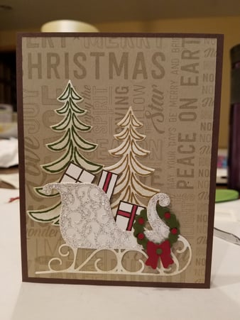
Wow! I love the bones of this - add another package and some bling on the wreath and this is A+ in my book! You nailed the triangle!
Wow...this is beautiful. I might use my smallest hole punch to punch holes in the same color of red as the bow on the wreath, glue a couple of the "holes" together, then add them to the wreath. No lumps for the mailman to check. Again, a very beautiful card.
here is my final and glued together. So it it a go ? Is the base color ok (chocolate chip)? Or should I change it? Thank you everyone for the great ideas.I added wink of stella to the wreath and berries
__________________ Sheri
Still collecting and organizing!
I agree, it�s a go! I had a fleeting thought that a bright red card base, to match the red in the bow & berries, might give this a nice color punch. However, when I thought about it further, the brown base is a nice compliment to the brown tones in your background design and in the trees. This is wonderful just as it is!
You can always make another card and experiment with different layouts and card base colors and sizes. It might be fun to try a similar layout of these same elements on a square card base, or on a larger format retangle shaped card (A6 is 4 1/2 x 6 1/4�) It�s my guess that extra space would make for easier placement of the pieces and that you would have plenty of room for that pretty sentiment panel that you had originally on this card.
It�s been so fun to watch the changes you made on the card, thanks for sharing them with us!
I ADORE your card! I appreciate all of the thoughtful ideas shared here that helped you transition your art. I learned a lot from this post (I am a visual learner).
Just wonderful! Thank you for letting us all play; you have a brave spirit! I'd have had my eyes partly covered with my hand, wondering if I dared to read all the posts!