Splitcoaststampers.com - the world's #1 papercrafting community
You're currently viewing Splitcoaststampers as a GUEST. We pride ourselves on being great hosts, but guests have limited access to some of our incredible artwork, our lively forums and other super cool features of the site! You can join our incredible papercrafting community at NO COST. So what are you waiting for?
We are moving to a new house and I am interested in knowing what colors you all used in your stamp rooms. Maybe I can get an idea from someone. I have changed my mind a bizzillion times over the last two weeks. I would love to see some pictures too.
Coincidentally (?) there's a very similar thread running on the SU demo only forum. Mine is pale pink because the previous owners of our house painted a lot of rooms in this pink, and it's quite easy on the eye.
I guess the main thing is to keep the colour light so it reflects the available light in your room.
White! Gives me a fresh, clean look without feeling too cluttered with my supplies in it. I can change the look and feel with accessories and I like that.
Mine is some sort of builder's white. With white curtains and mostly white furniture. I used to think I needed bold green walls, but after seeing the way it changed the color of the light in another room painted that way, I decided to stick with clean and light. If we have to paint in our next home, I might consider very light and clean (read: neutral) tans and grays to offer a bit of contrast with white moldings.
The Bathroom off my stamp room is purple and white. My stamp room is currently grey. There is only one wall that can be seen and eventually I want to paint it a toned yellow green.
__________________ Denise
"If a person who indulges in gluttony is a glutton, and a person who commits a felony is a felon, then God is an iron.�
― Spider Robinson
Mine is some sort of builder's white. With white curtains and mostly white furniture. I used to think I needed bold green walls, but after seeing the way it changed the color of the light in another room painted that way, I decided to stick with clean and light. If we have to paint in our next home, I might consider very light and clean (read: neutral) tans and grays to offer a bit of contrast with white moldings.
I agree! I've noticed since I painted my room (from a dark green) to bright white that my photos turn out better, I use my lamps less, and it just seems brighter and happier. I only have one window and am glad I stuck with the white for a lighter, airy feel.
When my oldest DD sits in my craft room she looks around and says "I feel like I'm sitting in a great big clay pot". I guess that pretty much describes the color of my room. It doesn't sound so appealing, but really it is nice and warm and goes great with the fabrics, cabinets, and storage I have in the rooom. I find that it looks great with deep reds, blues, creams, and tans. I keep thinking maybe I should paint, but it really does make me feel warm and cozy.
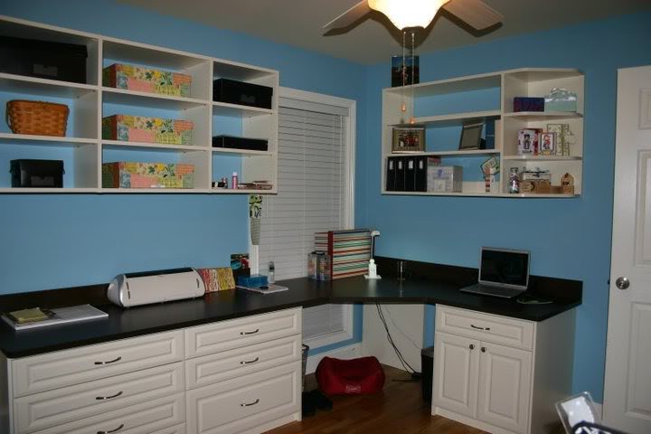
Mine is baby blue and white. Its faux finished and looks sorta like water. I have 3 white shelves above my desk with candles, candleholders, glass bottles and jars all in different blue tones. I love how light and fresh it is!
Mine is yellow, almost like SU!'s So Saffron. I have Black furniture and a carpet with yellow and red. My cushions on my chairs are bright red to match my carpet.
__________________ Lauren Live to stamp, stamp to live!
My studio is white with one wall a beige and purple accent..I rent so therefore the colors stay but I have hidden most of the wall with storage..My accent colors are black and pink.
__________________ KIM Blog
Certified SDU Instructor
Currently my walls are a soft green, but I plan to paint it "Tempting Turquoise" in the next few weeks. All of my accents will either be white, lime green, or brown. Maybe a touch of orange & red, too.
I painted my scrap room bubblegum pink with spring green, orange and yellow accents. The pink sounds like a bold colour but the time you add the other colours it softens. These are my happy colours! Good luck with yours!
Ooohhh! I can tell all of you who love SU! It's so funny to see comparison's according to SU color chart! Makes me smile. My craft room happens to be a space in the living room! I get one wall, with three shelves two cabinets and wall hangings to hold my stuff! So Wall is Very Vanilla but if you count the sofa colors....night of navy! (maybe a bit lighter)
CTMH had a paper pack called Emporium (it's now retired) that I loved so much I used the colors in my craft room. I wanted it to be an inspiring space, so I decided to be brave (for me ) on the color scheme. The walls are sweet leaf. Some of the shelves I painted in cocoa. I used cocoa, buttercup and crystal blue as accents.
I made a colour of yellow and blue and a little black and mixed it up and it turned to mellow moss... top half of room one wall.... other walls and bottom of one is chocolate, (almost) early espresso!!
Mine is pinky-lilac. I hoped that I would keep my DH & sons out of my space, by choosing it...nope. I still have boys hanging out in here all the time.
Why would they come in here to watch a 13" tv, and sit in a office chair, when there are so many more comfy places in the house???
My room color is called "Rejuvenate", and it is Behr paint from Home Depot. In terms of an SU color, I'd probably call it Certainly Celery. I have a pine armoire and pine desk in my room, and this color works well with these wood tones.
Mine it two toned... upper side is pink and the lower half is Gulf of Mexico greenish blue...I have a butterfly border at chair rail level... and they top half of the wall had butterflies that i cut out of extra border and it looks like they are flying off the border and into the room... Love my room.
mine is white with a soft gray sponged on the walls ( my daughter and i did it together when she was 10 ) now she is 28 and I still love the colors, can't bring myself to paint over it. Accents in room white furniture, with soft green accents lamps and pillows. I play in my room every sunday from breakfast till bedtime. I love, love , love my craft room. Four work stations and very organized.
Thanks everyone. Well I have chosen a light lime green (kind of a Gable Green maybe a tad brighter) and a rich aqua not quite turquoise. I painted three walls in the green and one aqua. I have white and natural maple cabinets and shelves and the same aqua color baskets and accents. I will take a picture when I get it all moved in and set up.