I learned a new technique today with the cool tool. Thanks very much, ANN!
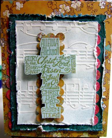
I only tried two colors on the Allegro folder before I settled in on the one you see. I used a white cs and SU soft sky ink and worked as Ann described in her thread. I did ink the raised areas with ColorBox Chalk alabaster to be more in keeping with the rest of the papers. I like how adding color pops the texture. My kickstand card is from the K&co Urban Rhapsody collection of doublesided papers. I used the same background to cut a scallop mat for the cross with the nestabilities...cutting and piecing to fit. I also punched circles and cut in half for the scalloped borders on both sides of the image. VERY cool idea, thanks to all of you who are doing that! The edges are heavily distressed and with the paper being so thick, I got really nice tears...I like the texture it adds, how about you? My cross is from Stampendous. I inked it with Brilliance Galaxy Gold and embossed in clear ep...it is stamped on SU soft sky and cut following the contours of the letters. It is popped on foam dots.
Thanks so much for looking and your comments, too!
Date: Monday, March 17, 2008 GMT Views: 985
Favorited:4