CC109 Color combination challenge:
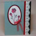
Real Red, Sage Shadow, Basic Black
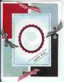
Let's face it. I am not a 'red' person. There are very few colors that I think red looks good with, and Sage Shadow is not one of them. I laid out the three challenge colors on my table, and I won't tell you what the colors first said to me, but it came down to 'ugly, yet....vintage'. I used stamps that I adore so that maybe I would not hate my card too much. I don't hate it, but the colors still are not pleasing to me.
The weird thing is that I have 3 kinds of red ribbon, and used two of them on this card. The ribbon was purchased for Christmas projects, no doubt.
Lace is from an old retired set. I used Sage craft ink, embossed it with clear powder for dimension, and punched out the circular holes to make it look even more like eyelet lace.
The ovals were cut by hand. The roses were going to be on a layered rectangle, but a vintage cameo came to mind, so it had to be an oval.
Date: Tuesday, April 10, 2007 GMT Views: 1127
Favorited:14
Registered: February 7, 2006 Location: Out West Posts: 24437
Wed, Apr 11, 2007 @ 8:44 PM
What a wonderful card, Alice. You say you don't like red, yet you did a perfect job here. I love that Bothway blossoms in the oval shape too. Neat embossed last!
------------------------------ Just another beautiful day at the beach. **** KAY****
Registered: November 26, 2005 Location: East coast of Florida Posts: 41
Sun, Apr 29, 2007 @ 7:56 AM
I think it turned out really nice and I am so grateful for your detailed explanation of how you created your card. I really liked the lace effect. Went into my favorites. TFS