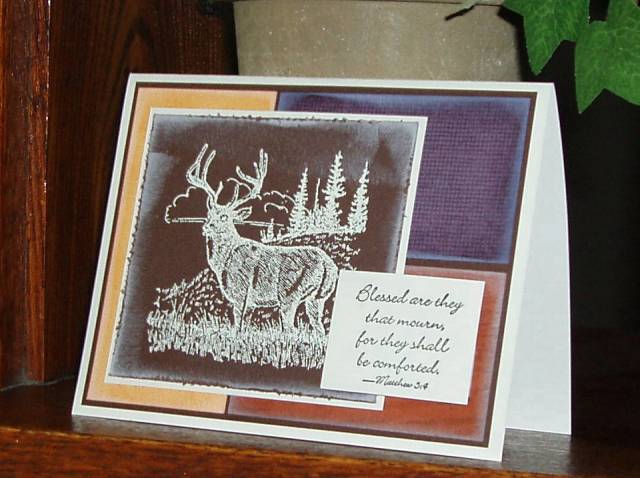
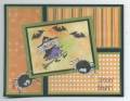
I needed a masculine sympathy card so decided to go with this week's sketch again -- great sketch -- but this card is nothing like I envisioned when I started. But, it's done and I need it, so I'll use it.
It is DTP'd with white craft ink which gives it a rather cold and frosty look, which is certainly not what one would want on a sympathy card, but it doesn't look quite as cold IRL as it does in this photo.
Date: Saturday, October 28, 2006 GMT Views: 1570
Favorited:12
Registered: December 30, 2004 Location: Where ever I go...there I am! Posts: 64166
Sat, Oct 28, 2006 @ 9:08 PM
I did that 'nothing like I invisioned when I started' for the IC challenge today.
I really like your colors on the under panels and the sentiment placement. TFS!
Registered: October 25, 2004 Location: Southern Oregon Coast Posts: 17641
Sat, Oct 28, 2006 @ 9:48 PM
I think it's beautiful and very appropriate. Really nice colors and, rather than make it look cold and frosty, I think the craft white just sort of softens it. That's a really nice and comforting sentiment, too.
Registered: May 24, 2005 Location: Behind the Lens of a Cannon 40D Posts: 20038
Tue, Oct 31, 2006 @ 12:05 PM
What a great balance of masculine and sympathy! These are probably 2 of the hardest cards for me to make, so you get a HUGE HIGH FIVE for a super job! Keep up the great work!