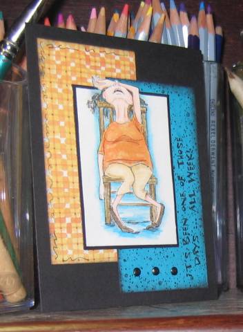
Love this image set from Art Impressions! Thought I'd try hanging her out of the box a little as a few others have done. She is colored with prismacolor pencils. I watercolored around her for a little contrast. It's been a long time since I made a black card - I kind of like the contrast there, with the complementary colors. My son (5) insisted we needed polka dots so I added the bg stamp from Hero Arts on the turquoise layer, and a little bit of doodlin' of my own on the orange. It looks smudgy on the orange - it's just sponging that looks a little heavier on the white areas of the plaid.
Date: Wednesday, September 27, 2006 GMT Views: 2653
Favorited:38