F4A365 = use Pantone "in colors" for spring to choose a palette that must include "Greenery".
This card is also for PTI Anniversary 2013 Challenge.
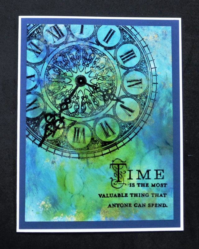
I used Tim Holtz alcohol inks in colors that were close to those given in the chart. The Pantone colors were: Greenery, Island Paradise, Niagara, and Lapis Blue. After the bg was done, stamped all the other elements with Stazon black.
TFL
Date: Friday, February 17, 2017 GMT Views: 1157
Favorited:12
Registered: June 22, 2004 Location: Ontario, Canada Posts: 126411
Fri, Feb 17, 2017 @ 8:39 AM
hello gallery neighbour, my friend!
Super card, great rich colours and I love that clock image. We have many antique clocks and this one reminds me of that.
TFS
xx Karen
Registered: January 20, 2010 Location: Brampton, Ontario Posts: 26123
Fri, Feb 17, 2017 @ 9:34 AM
Love the intense colour you've achieved in your background! I had a dress in 1966 with just those colours. :-) Beautiful sentiment and perfect imagery to go with it. Super card Sallie!
Registered: January 20, 2016 Location: Freetown, Massachusetts Posts: 31441
Fri, Feb 17, 2017 @ 12:12 PM
Beautiful! I'm not sure if the word I want is antiqued or distressed, but either way it works with your time theme here. I really like the gold paint touches.
Wonderful card, Sallie! I love the clock image over the alcohol inked BG! I notice you used glossy paper--I see so many using yupo and didn't know if the glossy would work.