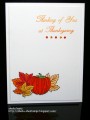
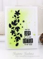
This is for today's CAS Challenge. I used Ombre ink for the greeting which looks better in real life than in this pic. I'm thinking black ink is better for greetings.
Thanks for the fun challenge and for taking a look!
Date: Monday, September 26, 2016 GMT Views: 411
Favorited:3
Registered: June 10, 2011 Location: Canberra, Australia Posts: 7326
Tue, Sep 27, 2016 @ 4:37 AM
I am very envious of the way you have created such a delightful CAS card. Love the way you have matched the colour of your sentiment with the bright colours of the pumpkins.
Registered: March 8, 2005 Location: Halfway between Dallas and Houston Posts: 23975
Thu, Sep 29, 2016 @ 7:45 PM
I need to learn that this is what CAS should look like. You have it down. I need some work on keeping my cards CAS. The coloring on the sentiment looks great! I used colored sentiments very often, but I do think in black it would pull the image and the sentiment together more on this card since the image was stamped in black!
------------------------------ Proud Fan Club Member
Dirty Dozen Alumni
"Art washes away from the soul the dust of everyday life."