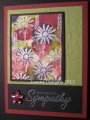
I played around with this fun technique the other day and took one of my panels as my focal point for this week's sketch from Carey.I cut my panel a little too small so I cut another piece and added it on backing with Eggplant. I went ahead and sliced my piece again to make my previous cut look more intentional. I used a tutorial called Copic Ink Background with Adirondak inks and hand sanitizer on glossy paper. I used several layers of color and copper and pearl alcohol inks along with the hand sanitizer that removes some of the color and pushes the color around (that's where the blue color comes from!). I chose Pool Party as an accent color on the diagonal piece and also a similar blue for my ep on the sentiment. I picked up the copper in the bg panel with some copper cord layered over a narrow strip of Eggplant. I took the Wasabi bg color and diecut my fern in that curling the leaves up and only gluing the stem in place. I popped my focal panel over the diagonal. On the inside of the card I used more Pool Party and Wasabi.
Step by Step photos on my blog.
Date: Tuesday, July 28, 2015 GMT Views: 3235
Favorited:11
Registered: April 13, 2011 Location: Midwest Posts: 178
Wed, Jul 29, 2015 @ 8:58 AM
Your Beautiful background looks like a Masterpiece by a famous artist from a famous museum!!! The addition of the diagonal with the copper accent is Perfect! And your styled fern really sets it all off.
Registered: August 21, 2007 Location: Wayland MA Posts: 105130
Wed, Jul 29, 2015 @ 1:31 PM
Clever to do the additional cut......I thought it was on purpose anyhow! That's a really nice fern die cut. GReat colors!
------------------------------ Anne HarmonFS154, QFTD58, PROUD FAN CLUB MEMBER (photo of our Great Granddaughter Elise, just 6 months old) and me, even older.
Splitcoast Dirty Dozen Creative Crew SU Design Team Alumni
Registered: January 7, 2007 Location: Southern California Posts: 42792
Wed, Jul 29, 2015 @ 7:00 PM
Gail, this is especially beautiful. I love the deep jewel tones you brought out with this technique. Choosing Pool Party for the diagonal panel was brilliant as it allows your main image panel to pop.
------------------------------ Kathy Stamp n Sip with me
Registered: October 21, 2010 Location: in the okanagan in b.c. canada Posts: 13012
Wed, Jul 29, 2015 @ 7:11 PM
WOWZERS...so neat. Not just a card but for a wall. Awesome colors together and LOVE that bg for the fern...well done...TFs..:0)
------------------------------ We as people are raindrops of colorful ink , falling down Crisp and Clear, each a different shade more vibrant then the last, but once we realize at the bottom of an endless abyss we all fall into the same inkpot forming one color, only then can we come together as one My son.