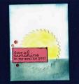
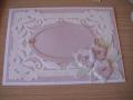
Sorry the pic is weird. I can't figure out why it's a little blurry and why there are shadows in it? There was nothing reflecting into the matte paper/ink. Hmmm.
I used the CAS sketch to try to do a new-to-me TLC technique called camouflaging. It was fun to do but I think I went a little off-technique by adding color to my sun and to the edges of my card. And ... it was all I could do to not add vintage photo to the edges of my sun, as well as, faux stitching. It just looks so naked. Hee. I guess I should have made a white circle night moon instead, huh? Then it would have been a more true camouflage technique. Hindsight is great, ain't it? Next time.
In the meantime, thanks for looking!
Date: Monday, June 29, 2015 GMT Views: 959
Favorited:2
Paper: Paper Studios, scrap cardboard box (white inside), I think the coral color is SU?
Paper Size: A2
Ink: Stazon, Ranger distress
Accessories: PTI die cut, Vagabond, large post-its for masking, Avery Elle sequins, sponges, Tim Holtz distress tool, Tombo mono glue, Xyron tape runner, $1 store foam mount squares
Techniques: distress inking, masking, sponging, die cutting, distress tool edges
Splitcoast Dirty Dozen Alumni Proud Fan Club Member Splitcoast Challenge Hostess Teapot Tuesday TEAm
Registered: April 18, 2011 Location: Melbourne, Aus Posts: 51844
Tue, Jun 30, 2015 @ 11:28 PM
You are so funny Miss Gabby. This is terrific and a great combination of the challenges. I am glad you mentioned the blurry bit, that has happened to me before using greenish/blue distress inks....weird hey.
------------------------------ Susie
Please don't take your organs to heaven - heaven knows we need them here.