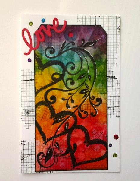
Whooo hooo... it's like winning the lotto. 2 challenges that were just what I needed for inspiration. I wanted to make a valentine for each of my sons, but now that they are teenagers (17 and 19) cute animales with glued on googlie eyes just woun't do. The MIX106 called for bright colors and a love theme, and the CAS311asked for rainbow colors. I like how this turned out, but it wasn't what I thought I was making. That happens a lot in my case. I used the direct to paper technique then blended the distress inks... looked nothing like the Tim Holtz tutorials. Because it was darker than I wanted, I sponged water through a stencil - also did not turn out like the other TH tutorial I saw. Finally, I put some bleech on a cotton swab and added blotches. Used a little white gel pen to highlight the flourish and added some rainbow stickles. TFL, Francie
Date: Monday, February 9, 2015 GMT Views: 1010
Favorited:6
Registered: February 21, 2007 Location: Bay City, MICHIGAN Posts: 17556
Mon, Feb 09, 2015 @ 7:32 PM
Francie - I love the brilliant colors in both of these cards - it must be quite a situation to make "similar" but "different" cards for your sons, but you sure have achieved it well with both of these designs - The grid in this one sure turned out cool!
------------------------------ SUE aka GREENIE - Twisted Sistah Handmade cards because..No one displays an email on their mantle, or saves a FB post in a box of treasures! Nothing is impossible with God!