I combined the two challenges, and learned something important.
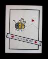
The sanding of dry embossing would look better on a cardstock that didn't have white in the bg!! I'll try this again with a different cs, and I'm sure the results will be a stronger embossing feature!
Date: Monday, February 11, 2013 GMT Views: 1973
Favorited:10
Splitcoast Dirty Dozen Alumni SCS Gallery Moderator Splitcoast Challenge Hostess Teapot Tuesday TEAm
Registered: July 27, 2007 Location: Dublin, Ireland Posts: 131598
Mon, Feb 11, 2013 @ 9:36 AM
How funny! Because I had the opposite experience! The first DP I tried had no white, but I was glad I'd had the foresight to try a scrap first because it looked like nothing on earth when I sanded it. Second time I tried some paper with white and loved the look. I guess it all depends on the paper... You ended up with a sweet card, anyway; the gingham looks totally fab with the sweet pink.
Registered: November 7, 2006 Location: Willamette Valley Oregon Posts: 34503
Mon, Feb 11, 2013 @ 10:03 AM
wow, I am loving this one though with the addition of the checked ribbon, you can't help but be drawn into the middle of the card and then...you see the depth of the DP. Pretty
------------------------------ Susan~~~One4Joydaily I'm a FAN CLUB member, U? MY GALLERYof visual Delights MY BLOG
Registered: April 4, 2008 Location: Sahuarita, Arizona originally from New Brunswick, Canada Posts: 18436
Mon, Feb 11, 2013 @ 10:44 AM
wow Anne, this is absolutely gorgeous... love the light sponging on the heart and the bg ef is perfect for this... also love the beautiful bow... great job mf....


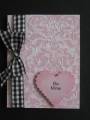

 Love the ribbon with the pink.


