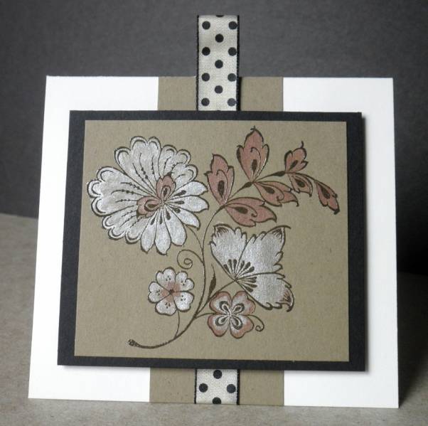
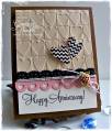
This week the color challenge is to use, black, kraft and vanilla, with the dessert option to make it CAS and classy.
This stamp reminds me of the embroidery my Mom used to do. Figuring out how I wanted to use this stamp proved difficult until now. This is the first card I made for this challenge, though I had stamped this image on another sheet of Kraft yesterday, but left it not knowing what to do with it.
This is stamped in black and embossed in clear. Then I used the aqua painter to paint it with Tsukineko metallic inks.
Date: Tuesday, February 5, 2013 GMT Views: 1878
Favorited:8
Registered: February 9, 2010 Location: Mentone, California Posts: 7361
Wed, Feb 06, 2013 @ 1:33 PM
This is one of those cards that I imagine is even MORE beautiful IRL! I love it when we figure out what to do with a long owned stamp or die...you have done this one justice. Such a gorgeous card!!!!
Registered: February 5, 2007 Location: St. Louis, MO Posts: 92462
Thu, Feb 07, 2013 @ 6:04 AM
I love your technique for coloring your "folk art" type floral design, Jennifer. The subtle shades and white really make it stand out on this beautiful card.
Registered: October 21, 2010 Location: in the okanagan in b.c. canada Posts: 13012
Thu, Feb 07, 2013 @ 10:52 AM
Sometimes when one puts something down your working with and walks a way a bit and comes back....this gorgeous artwork is what happens. wonderful job with the color challenge. I have more trouble with them as never sure what to do with them either. you rocked it and your first challenge here...right on way to go. Very pretty. I bet IRL its just stunning with the metalic paints. Lovely way to christen that stamp....TFS...:0)
------------------------------ We as people are raindrops of colorful ink , falling down Crisp and Clear, each a different shade more vibrant then the last, but once we realize at the bottom of an endless abyss we all fall into the same inkpot forming one color, only then can we come together as one My son.
Registered: April 6, 2009 Location: Weyers Cave, Virginia in the Shenandoah Valley Posts: 31117
Fri, Feb 08, 2013 @ 2:21 AM
I was wondering what you used to color this pretty image, Jennifer. Those metallic inks are the perfect choice since they look super amazing on your card! You created a fabulous work of art here~
------------------------------ ~Roberta
�Ability is what you're capable of doing. Motivation determines what you do. Attitude determines how well you do it.�
― Lou Holtz
Registered: September 21, 2006 Location: In the beautiful Sequatchie Valley, Home of the Paper Clip Project - The National Cornbread Festival Posts: 26563
Registered: September 21, 2006 Location: In the beautiful Sequatchie Valley, Home of the Paper Clip Project - The National Cornbread Festival Posts: 26563
Splitcoast Dirty Dozen Creative Crew SU Design Team Alumni
Registered: April 4, 2006 Location: St Louis, MO Posts: 6368
Sun, Feb 10, 2013 @ 4:01 PM
Very cool card! Love the image on Kraft and then painted with metallics. You have inspired me to head to the basement and get out the kraft paper! Lovely!