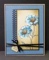
Peggy gave us a wonderful color combination for the CC today. They are:
Pacific Point
Not Quite Navy
Sahara Sand
I very lightly painted my flower heads with a THIN coat of white acrylic so the colors of Copics that I chose to be like Pacific Point would be truer than if I had used them directly on the Sahara Sand.
TFL
Date: Monday, September 24, 2012 GMT Views: 4606
Favorited:46
Registered: January 10, 2009 Location: Ohio Posts: 3192
Tue, Sep 25, 2012 @ 5:12 AM
Beautiful card.....I love the whole thing, great coloring....the shadding around the edge of the flower panel is just the right touch and I love the thin ribbon and tiny tag...
------------------------------ Doni My Gallery My Blog
Fan Club Member
CAS Challenge 2014 Spring Design Team
ATCAS design team (2015 - 201
Dirty Dozen
Registered: August 15, 2007 Location: Twin Cities MN Posts: 50472
Tue, Sep 25, 2012 @ 7:59 AM
Aren't you the clever one to paint some white next to colors to make them stand out..great tip! I love the darker border and ribbon..that makes your blues stand out,too....a real beauty Sallie!
Registered: February 13, 2005 Location: Southern Ontario Posts: 26256
Tue, Sep 25, 2012 @ 8:16 AM
Gorgeous! Those colours really work well together and in your expertly creative hands they turn fabulous. Cool idea to paint the flowers first to get the true colour. Love it.