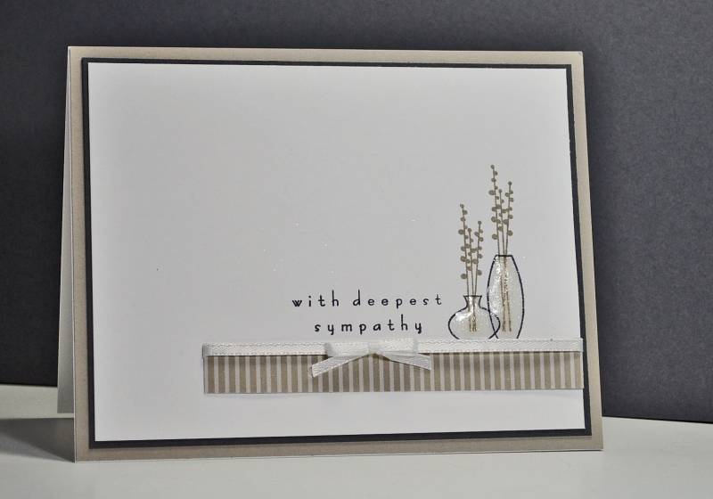
Our church card ministry is often in need of sympathy cards. I like to keep mine very clean and simple and I thought these vases on a "shelf" would be the right look for sympathy.
The Color Challenge for today included three neutrals: Whisper White, Basic Gray and Sahara Sand. I love these neutrals because they are so soft and gentle!
Registered: October 3, 2007 Location: Prescott, AZ Posts: 989
Mon, Apr 16, 2012 @ 8:17 PM
Pretty genius that you can make a card with those colors look elegant, rather than drab. The type font of the sentiment is so perfect with those vases, and the vases being clear like that ...........I would have bypassed those stamps because I wouldn't have been able to figure how to "color" the water.
I have a really cute stamp of a stick figure girl sitting on the edge of a martini, but I've never used the stamp because I couldn't figure how to color the liquid in the glass. You've solved that for me! YAy! Thanks for the inspiration.