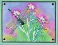
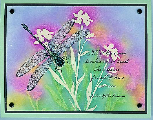
This layout is a CASE of Kim Van De Riet's gorgeous Paint Prints & Wonderful Wings card: Gallery at Splitcoaststampers Here I used The Art of Life hostess set and the double resist technique, also called "Pressing Out the Details" because you use an iron to remove the embossing powder (it's the only time I use an iron any more ). The colors are based on the Fiesta Spectrum Pad. Kim's way of doing the dragonfly is fantastic - it looks so real!
Date: Thursday, May 5, 2005 GMT Views: 1660
Favorited:45
Stamps: Art of Life, Wonderful Wings, All I Have Seen
Paper: Vanilla, black, gable green
Ink: Black Stazon, clear embossing ink, Summer Sun, Marvelous Magenta, Ballet Blue, Taken With Teal, Gable Green, Lavender Lace
Accessories: acetate, clear detail EP, iron, sponges, pastels, vintage brads, two way glue pen, pearl ex (interference blue, green and red, plus spring green and true blue)
Techniques: double resist, pressing out the details


 ). The colors are based on the Fiesta Spectrum Pad. Kim's way of doing the dragonfly is fantastic - it looks so real!