This is my sample for Robin's fun Free for All Challenge, the challenge can be found here .
I look upon my card making as a hobby, not necessarily a process that will result in a card. Spending money on a hobby is happy experience and far healthier than thinking every card cost $92.80
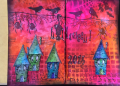
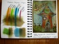
I don't have a typical art journal with gesso'd pages, lots of paint and gorgeous sticky out bits, mine is just an A5 (app 5.5" x 8") Monte Marte (el cheapo) visual art diary. They cost less than $4 so it is never a drama to rip a few dodgy pages out. I stick card fronts onto the pages so the quality of paper is not important. Having said that, the left hand page here was done by colouring directly onto the cheap paper and is not exactly as it would come out on cardstock or photocopy paper, but it is near enough. The whole idea of the book is to remind me about techniques and colours and to use a lot of the weird stamps and sentiments that I have.
I have been doing a lot of bright colouring lately on photocopy paper using Prismacolour Pencils, Distress Crayons / GelatoÂ’s (if you own GelatoÂ’s you already own Timmy's crayons) and alcohol markers. This sample shows how a bright and colourful card can be instantly aged by scrubbing the entire thing with Walnut Stain distress ink.
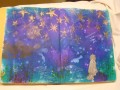
I often take the super bright look away by gently swishing a pre-stained Walnut Stain foam blending tool over the card, however to achieve this true vintage look I used the Smack & Squirt technique followed by very firm scrubbing of the blending tool over the whole card.
Smack walnut stain distress ink onto aluminium foil, squirt on a fair bit of water and use a foam blending tool to mop up the inky water. Scrub over the card. Give the card a blast with the heat gun before scrubbing on more watery ink, its best to build up the stain rather than inking up the foam blending tool straight from the ink pad.
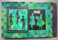
To continue with the vintage theme, all garden stamping and crackle stamping was down with dark brown (ground espresso) distress ink. Doodled border was also done with fine brown micron pens. The background is from an 8" Graphic45 paper pad from a lifetime ago. I was surprised how much water the G45 paper could take, especially as the grass and sky were also done with the Smack & Squirt technique. The little clock is from a G45 paper and the big clock face is from a Prima set of embellishments. The clock hands were made by using a brad back to front.
Thanks very much for looking. I hope you all have a lovely weekend.
Date: Thursday, September 8, 2016 GMT Views: 2254
Favorited:15
Registered: December 4, 2010 Location: Minnesota Posts: 16610
Fri, Sep 09, 2016 @ 9:22 AM
My goodness Susie I am speechless because your art journal with card are so amazing!! And I am never speechless (just ask my husband- heehee). I recently purchased a really cheap art journal because I do want to record color combinations on projects I use and so forth. Thank you for outlining your process here because this really helped me know how to get started with my own journal now. I love the method you use to distress your projects with and it is something I would not have been able to do on my own. Your card is a true masterpiece- and inspiration! I chuckled how you used the brad legs to make the hands of the clock- that is brilliance at its finest right there! I am putting this into my favs for future reference. It is a true joy to find your incredible work-of-art cards in the gallery! ~Karen.
Registered: August 15, 2007 Location: Twin Cities MN Posts: 50607
Fri, Sep 09, 2016 @ 10:04 AM
Ditto to what everyone else has stated....I LOVE this!!! Thanks for the explanation of the walnut-distressing part...fabulous tip for those of us who have this penchant for vintage. And how did you know how much I spend on each card..shhhhh...don't tell anyone, ok? FYI-just got some Lavinia stamps...you are such an enabler...
Registered: September 3, 2007 Location: native Texan living in extreme N. GA Posts: 73392
Fri, Sep 09, 2016 @ 5:38 PM
Fabulous, Susie! I used to keep journals w/ scraps, try outs of images/colors & list all the colors & things on it. After about 10 of these filled up, I sort of stopped. I think yours is over the top wonderful.
Splitcoast Dirty Dozen Swapper of the Month June 2012
Registered: June 25, 2004 Location: NW Indiana Posts: 28458
Fri, Sep 09, 2016 @ 7:48 PM
Oh. My. Goodness! How I LOVE this! The colors, the blending, the image, gorgeous! And the backwards brad for the clock hands! Love every element. What a fabulous art journal page.
Registered: March 11, 2013 Location: Ingleside, IL Posts: 2449
Fri, Sep 09, 2016 @ 10:20 PM
My dearest sweetest Susie! Where to begin...I agree with everyone (page 1). You're warm, creative, bubbly personality shines thru in all of your cards. I love your "Smack & Squirt" technique and so glad you described in detail here. I've wanted to ask you about it for a while.
Ain't it the truth about what we spend on our beloved hobby! (Yes, I used slang!)
It's hard for me to tell you my favorite feature, since this a cohesive card, but the crackle adds so much drama. Very clever vintage choice...I use DI tea dye but will give Walnut stain a go next time.
You know it's coming, but a double dose of HUGAROONIES to you dear friend!