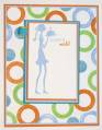
Well....I used one of Stef's chosen inspirations only because I just couldn't decide on one of my own.....what fabulous packaging those companies used....so fun to browse and imagine!!!
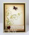
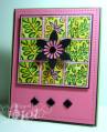
However, I did two versions of my inspiration card. One was done with bright, bold colors, while the other was done in warm neutral colors. I like both, but they sure do give a different feel based on the color.
Thanks for looking.
Date: Saturday, June 13, 2009 GMT Views: 1080
Favorited:10
Registered: April 20, 2005 Location: The only Eaton Rapids on the Earth, Michigan Posts: 57568
Sun, Jun 14, 2009 @ 2:39 PM
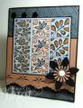
Wow! I would have never thought to put the basic gray with the creamy caramel, and they are beautiful together! I love your border punch, the pretty designs, and, again, the black flower. Gorgeous work, gf!
Registered: August 29, 2007 Location: Cambridge, Ontario Canada Posts: 20999
Sun, Jun 14, 2009 @ 3:27 PM
Joanne, I love the tiles in your main panel "that would make a nice back splash", great colors combination, LOVE your bg panel "it's beautiful" and the finish with that pretty flower. Terrific card.....
------------------------------ Nicole
DT member for Mark's Finest Papers
I am a pround member of SCS. My blog