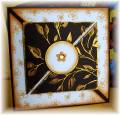
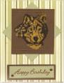
Here's my card for the Kraft Skies CC171 color challenge. I've had the kraft paper forever so was excited to try this challenge. I colored the black/white gingham ribbon with my blue ink pad to match the bashful blue cardstock (a trick my SU demo showed me).
I don't know why my swirl background stamped darker than the main image because I used the same ink and paper. Maybe because one is a rubber one, and the other is clear.
Date: Tuesday, June 17, 2008 GMT Views: 474
Favorited:2
Registered: August 7, 2007 Location: North Carolina Posts: 28113
Tue, Jun 17, 2008 @ 7:36 PM
This is lovely! What a neat and unique main image! I do find that clear stamps usually stamp lighter for me than rubber... not sure why but... anyway... I love that you inked your ribbon! Great idea! TFS
------------------------------ MY GALLERY My BLOG
No card is complete without at least one cat hair
DT: Our Daily Bread designs
Happily a Fan Club Member Romans 6:23
Registered: June 2, 2007 Location: Regina SK Posts: 17494
Tue, Jun 17, 2008 @ 10:57 PM
Very nice and a great layout!
------------------------------ Kathleen
For by grace you have been saved, through faith; and that not of yourselves, it is the gift of God... Ephesians 2:8