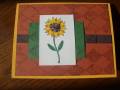
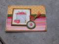
I used Bashful Blue, I swear...and Chocolate Chip counts as a neutral, right? ;) I did blue around the sunflower, but the camera washed it out.
I'm thinking about using this for my stamp club for October. Originally I was going to use the pumpkin image from this set, and then I was going to do the apples, but I like this since I picked it out for the color challenge. I think the Old Olive panel needs a little something else, maybe Versamark the leaves stamp on it. My original plan was to do gold brads and gold emboss the sentiment, but I don't *have* gold brads (guess what's on my next order...) and I figure why make it more complicated with the embossing powder, I'm already doing gamsol stuff and that takes long enough.
Yeah, my clubbers will love this...Old Olive and More Mustard are among their most hated colors I LOVE Old Olive and I think the Flannel Plaid tones down the More Mustard. Besides, what other color could you possibly use for a sunflower?!
Date: Tuesday, September 25, 2007 GMT Views: 640
Favorited:12
Registered: March 21, 2006 Location: sunny southern california Posts: 20098
Tue, Sep 25, 2007 @ 10:53 PM
The flannel background is really great for a fall scene!!! Nice job, love your watercolor technique.
------------------------------ christine m.aka summer and weekend stalker DOT INK (My yadda yadda) Don't magnify your problem . . .Magnify your God
PROUD MEMBER OF THE REDDIVAS!
Registered: April 28, 2005 Location: Philly suburbia Posts: 2453
Wed, Sep 26, 2007 @ 6:26 AM
This is a beautiful card! I think your students will learn to like them when they see this. I remember reading somewhere: There are no ugly colors, only colors you don't know how to use.


 I LOVE Old Olive and I think the Flannel Plaid tones down the More Mustard. Besides, what other color could you possibly use for a sunflower?!