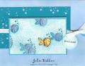
What I came up with for this week's challenge. A lot of people say this, but the colors truly look more vibrant IRL. I stippled the Blissful Blue CS with Taken w/ Teal ink, which you can't see here. I am loving this SAB set more and more!
Date: Wednesday, January 10, 2007 GMT Views: 1692
Favorited:89
Paper: Blissful Blue, Tempt. Turquoise, Taken w/ Teal, Naturals white
Ink: Staz-on Black, Tempt. Turquoise
Accessories: Colro Spritzer Tool, Temp Turquoise and Taken w/ Teal Marv. Markers, White Grossgrain, Silver Eyelet, circle tag, silver cord, 1/16" and 1/8 circle punches, Watercolor Wonders, Stipple brush
Registered: September 22, 2005 Location: Mason, OH Posts: 1683
Thu, Jan 11, 2007 @ 5:55 AM
This is FABULOUS!! I love how the orange fish really pops out against the blue fish! Love that it really looks like an underwater scene! Going into my faves
Registered: June 13, 2005 Location: newly relocated to beautiful Kamloops, BC Posts: 2001
Thu, Jan 11, 2007 @ 7:39 AM
what a great card - tfs
------------------------------ There is an 18 year gap between my daughter and my son... we wanted to make sure the first turned out, before trying for the second!!!
Registered: November 26, 2004 Location: Michigan Posts: 3273
Thu, Jan 11, 2007 @ 7:56 PM
This is adorable!!! I love how you made the whole school of fish and the one stand out. I'm saving this to try when my Very Punny finally gets here. :-)
------------------------------ My Blog Enjoy the little things, for one day you may look back and realize they were the big things. ~Robert Brault