This week we are sending Tea Potter cheer to nature lover, Cassie, who is in the hospital. Her favorite color combo is black, white and red. When you say red and nature, I say rose.
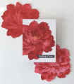
I love this BIG bloom stencil from Altenew. Someone who knows more about color theory could have figured out a better way to do this, but I don't know color theory and so I used my one bright red ink pad and just kept layering. But here's what I learned:
My first attempt (the bottom rose) I used a light hand on the first layer and when I finished the four layers it was way too light so I stenciled all the layers over it again. It still looked more pink than I wanted. So I switched to Bristol cs and on the second attempt (the top rose) I made the first layer fairly red. I love the reds, but I lost a lot of detail. And, so like Goldilocks, I found the "just right" on my third attempt which is what is mounted on the card. I fussy cut all the roses and will use the other two on other projects. FYI, for some reason my photo looks exceptionally good today...LOL...and IRL my red isn't quite so bright but it is red and it is pretty.
I used my favorite ef for a bit of texture in the bg and the printer trick Cook22 (Sabrina) taught me using Excel for the sentiment; which is to "fill" the cell with the desired color (this time black) and then you can "print" white. The font is Avenir. I added some stickles in the flower center for a bit of glitz.
It is no fun at all to be in the hospital and every bit of cheer and encouragement is a little ray of hope and optimism. My hope is that all the beautiful Tea Potter cards headed her way will fill Cassie's room and her heart with both. And, I hope your heart is filled with hope and optimism too. TFL
Date: Tuesday, October 18, 2022 GMT Views: 779
Favorited:5
Splitcoast Dirty Dozen Alumni SCS Gallery Moderator Splitcoast Challenge Hostess Teapot Tuesday TEAm
Registered: July 27, 2007 Location: Dublin, Ireland Posts: 132003
Fri, Oct 21, 2022 @ 4:49 AM
I'm glad you used the learning roses and incorporated them in the card. The bottom one has so much visual dimension that at first I thought it was a die-cut. I know I've used a single colour with stamping off for layered stamps, so I suppose you're using the opposite process with stencilling. I think it works well.
Now that I have a laser printer that prints real black, I must go back to this myself .
Registered: February 23, 2016 Location: El Paso, TX Posts: 23000
Fri, Oct 21, 2022 @ 9:05 AM
Your perseverance paid off as these roses are beautiful - I've never seen layering stencils but have tried muti-step stamped flowers - they NEVER look realistic to me although it's probably because my colors have too much contrast.
------------------------------ Linda aka Bubbles
I'm not a Hoarder . . . I'm the Curator of an extensive collection of embellishments!!
Proud Fan Club Member Guest Designer Color Challenge July 2017 Favorites Notification Team
Registered: March 13, 2011 Location: Langley, B.C. Canada Posts: 32131
Fri, Oct 21, 2022 @ 2:27 PM
You said Wow on mine and I am saying WOW on yours, Debbie. They are all beautiful. Love the weathered ef. A sharp contrast for your delicate roses. Awesome card for Cassie!!
Registered: June 4, 2009 Location: Deatsville, Alabama Posts: 83722
Thu, Oct 27, 2022 @ 2:42 AM
Wow - what a beautiful flower, Debbie. This is one gorgeous card! Hugz
------------------------------ Nancy Williams - Hope your day is Spirit-filled and ink-filled (in that order)!DRS Designs-DT, Punchkateerforever, Dirty Dozen Alumni
Gorgeous! I haven't tried layering stencils yet. You are so kind to share your learning experience using one ink! Impressive! Also love the creativity with using the Excel spreadsheet for your sentiment. Thanks for that tip too.


 .
.