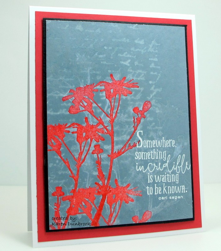
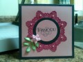
Really venturing out of my colour zones today. I did want to keep the same colours palette that Amber used but really wanted to change it up.
I stamped the flowers in red directly onto my card front instead of adding them on a panel. I embossed the flowers with clear powder then took my Distress ink pad and rubbed it directly over my card front. I left off the butterfly and stamped the script behind with water to add depth like the panel does on her card. I changed the orientation of the sentiment but tried to use one that had a fancy font like the one she used on her card.
Registered: May 23, 2009 Location: sunny california Posts: 9825
Sat, May 21, 2016 @ 4:42 PM
Even though you were out of your comfort zone, you suremade a pretty card. The bright, bold red is a real eye catcher and looks lovely with the more subtle blue.