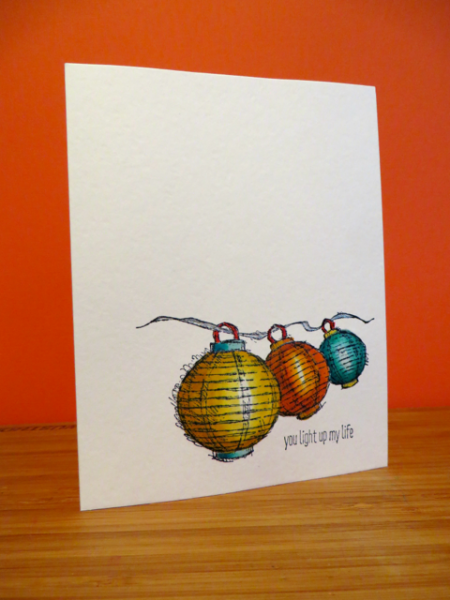
I would be totally lying if I didn't say that everything I'll be doing this week is inspired by what I learned at Convention and the many wonderful free stamps that they gave us....but I will also honestly say that the colors and textures of the inspiration site were also inspiring, especially this image with blended colors and soft circular undertones like the stamp set:
You can't tell but I capitalized on the bleed through on the back and used it as my guide to push the lantern images forward from the back with a stylus. This makes them appear rounded on the front of the card - giving a single layer card some dimension! It's a really neat effect (like toile) which is hard to capture in a photo. (If you don't like bleed through try using GinaK heavy weight pure luxury card stock as it doesn't bleed through - expect the colors to change slightly as well though.)
Please join us and create something uniquely inspired of your own this week!
Registered: August 21, 2007 Location: Wayland MA Posts: 105214
Sat, Jul 26, 2014 @ 10:24 AM
Oh Audrie, how clever to bump out the images from the back!! I love the colors of the lanterns!
------------------------------ Anne HarmonFS154, QFTD58, PROUD FAN CLUB MEMBER (photo of our Great Granddaughter Elise, just 6 months old) and me, even older.
Registered: January 6, 2004 Location: Connecticut Posts: 20543
Sat, Jul 26, 2014 @ 2:40 PM
Fabulous and great tip about the embossing!
------------------------------ Rediscovering the simple joy of stamping and exploring my art! Stamp your ART out! Share your thoughts. Let your heart sing.
Come check out my Gallery and leave a comment!
FS465