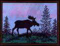
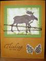
I have another card similar to this one in my gallery and this is perfecting the first one. First I learned to stamp the moose (using a stamp positioner) twice to get a full coverage with solid stamps. Then to get the pink streaks (not that pink in real life) I used H2O brush and ink after the blue was brayered.
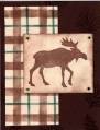
With a change of stamps, colors and adding layers, I like this one much better than the first.
Ranger resist ink was applied with a paint brush before the brayer of blue on the sky was added, then the pink was added last. It takes repeated strokes to achieve the look here.
Link to Ranger Resist Ink
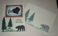
This card is headed to Iraq to a unit of soldiers whose homes and family were in the Katrina hurricane.
Date: Thursday, September 8, 2005 GMT Views: 8332
Favorited:116
Splitcoast Dirty Dozen Alumni Creative Crew SU Design Team Alumni
Registered: October 29, 2004 Location: Coos Bay, Oregon Posts: 24007
Thu, Sep 08, 2005 @ 9:29 PM
I did not think you could improve on your other card, but by golly I think you did. Both cards are absolutely stunning! The troops will want to frame and keep. Nancy
Registered: June 26, 2005 Location: Largo, FL Posts: 1093
Thu, Sep 08, 2005 @ 10:20 PM
This is just AMAZING! Your tree and foliage placement is in proportion to the moose. The coloring is so beautiful, and I agree with everyone who said it looks like the Northern Lights.
Registered: March 25, 2004 Location: New Bedford, Mass. Posts: 4934
Fri, Sep 09, 2005 @ 4:48 AM
What a gorgeous, striking and stunning card!! So very creative!! I love the the whole look of this card, it looks so real and three dimensional!! Wow, what a fantastic card, what a awesome job you did!!


 .
.


