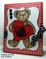
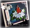
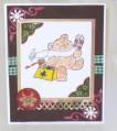
Hi! This card was made for today's Color Combination Challenge: Burgandy, Vanilla (Ivory), and Kraft (I used Desert Sand).
I have to admit that I almost sat this color challenge out. However, I remembered that I had some burgandy like dp, and could MAKE my own burgandy ink to sponge the image.
First, I wanted to "darken" the dp to make it closer to burgandy. I sponged Burnt Umber Palette ink all over the dp. This really made it darker. I sponged Cognac onto the striped dp to darken it.
The image was stamped in VersaMark and embossed in Copper. Next, I mad a MASK of the center and placed it over the berries. I sponged on Palette Claret for a red/burgandy/purple and then sponged in Burnt Umber and Cognac for a darker center. This really "looks" like burgandy.
Registered: April 6, 2005 Location: Stuarts Draft, Virginia Posts: 14401
Tue, Nov 10, 2009 @ 7:42 AM
Way to improvise! This image is one of my faves from Flourishes...beautiful job!
------------------------------
Wanda Cullen ~ Dirty Dozen Alumni, On design team for Papertrey Ink, Designer for Color Throwdown and Fusion Card Challenges Cullen-ary Creations[/URL]...my blogHERE'S MY GALLERY[/URL]