Registered: September 13, 2004 Location: In my Happy Place with no one bothering me....I hope! Posts: 13877
Fri, Jan 06, 2006 @ 10:08 AM
Honesty: Same as all your other comments... great colors and layout.... maybe just txture on the kraft background and/or ribbon, brad, etc. It's amazing how many beautiful cards we miss, isn't it?
Registered: July 13, 2004 Location: Grasonville, MD Posts: 7632
Fri, Jan 06, 2006 @ 11:12 AM
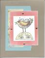
Brutally Honest.... I love the paper piecing on the bird and the layering of paper and cardstock. I agree with the other something subtle on the Kraft paper. Again I think we need a special section for non-SU stamps because we are missing some very cool cards and ideas!
Registered: May 2, 2004 Location: Far, far away Posts: 24216
Fri, Jan 06, 2006 @ 1:24 PM
Honestly? I don't think I'd change a thing! If I HAD to... I'd put a strip of black down the left hand side of the blue layer - not showing all round the layer, just down the left side. Hard to explain, but it looks great in my head!
Registered: December 15, 2004 Location: Mississauga, Ontario Posts: 4761
Tue, Jan 10, 2006 @ 12:20 PM
Honesty thread : I love the card. I'd add a ribbon vertically but no background as I wudn't want to take attention away from the pretty pattern paper or the pattern paper birdie.
Registered: August 21, 2005 Location: Beautiful New England Posts: 1145
Fri, Jan 13, 2006 @ 12:09 AM
Honesty thread: I like the acrd, but I don't really like the images. It is purely a subjective things, so nothing you could do to change my mind, lol! I do like the paper alot though!