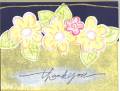
Just a quick thank you card. The white swish under the saying is white craft brushed on with a paint brush. I got that idea from someone else on this wonderful site!
Date: Sunday, May 1, 2005 GMT Views: 1445
Favorited:9
Registered: August 20, 2004 Location: Posts: 24944
Thu, Jan 05, 2006 @ 2:14 PM
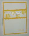
From the honesty thread: I love this card and really like the white swish! I think a bow might make it pop more than the hemp though. It is really cute!
Registered: July 18, 2005 Location: officially single again and BACK in PA!!! Posts: 7741
Thu, Jan 05, 2006 @ 2:31 PM
brutal honesty - I'm not digging the light pink with the navy, yellow and green on this one. I like the red though. Are the flowers stamped on Bazzill? or did you kiss them to the canvas stamp? a bit too much texture. I really like the swish of white, it makes the Thank you POP!
Registered: February 18, 2005 Location: In the South! ;o) Posts: 20604
Thu, Jan 05, 2006 @ 2:46 PM
Definitely change the hemp...Other than that it looks great! You could change up the colors if you choose to but not absolutely neccessary...Great Job!
Registered: January 14, 2005 Location: Posts: 7516
Thu, Jan 05, 2006 @ 3:27 PM
Hmmm. brutal honesty.... the hemp looks a bit lost to me, needs a bow or knot in it. Otherwise I like the white wash under the words. Will have to try that when I want to add word to a dark or busy background. TFS
Registered: November 6, 2003 Location: Omaha Posts: 3430
Thu, Jan 05, 2006 @ 3:37 PM
honesty thread: i like it! i think the flowers don't stand out as much so maybe the bottom layer of the card could be a different color so they don't blend so much? i like it as is though too!
Splitcoast Dirty Dozen Alumni Splitcoast Gallery Moderator
Registered: July 19, 2004 Location: Colorado Posts: 24169
Thu, Jan 05, 2006 @ 7:20 PM
Honesty: I'm not particularly fond of the kissing for the flower outlines. I would also use a darker purple for the large banana flowers. And, I can't visualize it so I'm not sure, but maybe put a knot in the hemp. I love the treatment on the greeting!
Registered: December 22, 2004 Location: Atlanta Baby!!! Posts: 2289
Thu, Jan 05, 2006 @ 8:34 PM
BH Thread - remove the hemp...it does not go with the "flowery" nature of this card. If you must, add an organdy bow to the bottom left and move the thank you further to the right.
colleen
------------------------------ Colleen Schaan - Education Specialist at Imagination International Inc.,/Copic Marker
Blog - Distinctive Touches;My Copic Books!
Registered: September 18, 2003 Location: Warwick, RI Posts: 1229
Fri, Jan 06, 2006 @ 5:51 AM
Honesty: I'm not excited about the textured flowers, either, and it seems like there's a bit too much yellow. But I love that set, and the layout is great! The little red flower is cute!