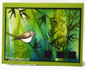
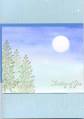
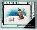
A woman asked me to make some cards with some poems that her boyfriend wrote printed on the inside of them. No problem I thought.
Well, if you look at my gallery, you'll see that I'm much more of a cutesy stamper than realistic. In that sense...if the poems had been limericks I probably would have been just fine! But they were deep poems that had serenity and nature in them and there was nothing cutesy about them. I tried Zindorf's brayer technique and failed miserably. So I ended up trying the watercolor wash technique but I didn't know what to do with the pictures once I had made them :( I kind of like how the main images turned out but I feel like I botched them when I mounted them as I did. I don't know how to make a non-cutesy card!! Help!!
I would love any input on how to make these cards better. BTW they are bigger than regular cards but smaller than a full sheet of cardstock folded in half...more the size of a Hallmark card. Thanks for your help with this one!!
Date: Wednesday, June 18, 2008 GMT Views: 595
Favorited:4
I like the off set border on two sides and the coloring. This brings alot of focus to the main images. Very very calming! I'd say mission accomplished! have a Happy........
Registered: January 29, 2005 Location: St. Louis, Missouri Posts: 467
Thu, Jun 19, 2008 @ 8:45 AM
I think it looks nice and serene. Another idea would be to do the same with the watercolor but do wispy type flowers in black or navy or any other solid color.


 But they were deep poems that had serenity and nature in them and there was nothing cutesy about them. I tried Zindorf's brayer technique and failed miserably.