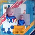
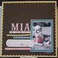
I was not going to post this pg. because I really do not like the way it came out, it seems a little piecey and/or disjointed. I really do not want to redo the pg. so ...if you have any suggestions as to what could make it better looking...please let me know...I would love the constructive criticism!
Date: Monday, April 21, 2008 GMT Views: 575
Favorited:2
Registered: August 16, 2005 Location: North T E X A S Posts: 31035
Mon, Apr 21, 2008 @ 7:42 AM
I like the pics, the big date and the distressing!!!
Here's the only suggestion I have:
The little square that says 'be you' is apart from the rest...maybe stamp something in that area that overlaps the other two squares and pulls it in with the arrow too - a BIG '6' maybe?
Registered: April 29, 2006 Location: Vancouver Island, BC Posts: 624
Mon, Apr 21, 2008 @ 8:39 AM
This is a really fun layout! Love the distressed edges and the big numbers. I agree with Sally, the little squares could be grouped more closely together somehow, so they're not floating?
------------------------------ Bonita
Stampin' Addict, SAHM of 3 cuties Vancouver Island, Canada
Registered: October 23, 2006 Location: Indiana Posts: 1928
Mon, Apr 21, 2008 @ 5:54 PM
I love those big #'s also!! So cool. I would agree with what the girls above said. Did you doodle around your tearing? I think you did and it looks awesome, and the staple on the tear, great!! Going to use that one!!!
------------------------------ April - My Gallery With enough caffeine, I could rule the world!! August Scrappin Goal 10/10 YTD 73/125 September 5/10 Pounds Lost 48/80 Out of my rut!!!
Registered: August 12, 2005 Location: Michigan Posts: 3833
Tue, Apr 22, 2008 @ 3:50 PM
Love the page -- very masculine (boy)!! I would rather see another little picture down there in that spot (be you). Of course, I am one that usually runs out of room for my pics so that is why I think add a pic, as you have a lot of accessories already. You could put a little corner of the square (be you) over the pic. Love it anyway!
------------------------------ Sandi (My Gallery - My Blog) "God is our refuge and strength, a very present help in trouble." -- Psalm 46:1
Splitcoast Dirty Dozen Creative Crew SU Design Team Alumni
Registered: November 4, 2004 Location: Montreal, QC, Canada Posts: 13717
Sat, Apr 26, 2008 @ 2:32 PM
LOVE those big numbers to add your date - so cool! Nice use of the sketch, too!
Congrats on making Design team, BTW! I'm very happy for you - well-deserved! Your pages always have so much personality and are oh-so-pretty! I'm looking forward to what you'll post in the future!
Cindy
------------------------------ Cindy French-Canadian SU! Demo and Fan Club member