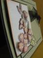
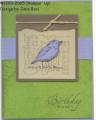
The colors for this card were inspired by the DD gallery--sorry, I can't remember the specific artist, but I just love the color combo--the birdie is cutout of the brocade blue and adhere with a dimensional--looks way better in real life!! I've dicovered you can get a really neat distressed/direct to paper look by sliding your canvas bkgrnd as you would the ink pad in dtp. It was actually oops that led me to this discovery!!
Date: Saturday, March 19, 2005 GMT Views: 850
Favorited:20
Registered: October 18, 2004 Location: Sunny FL Posts: 2933
Tue, Mar 22, 2005 @ 7:27 AM
This is beautiful! I had never thought of crimping in both directions. I tell you the ladies on SCS are just geniuses!! Thanks for the idea!
------------------------------ ~Vanessa "Not everybody can be famous but everybody can be great because greatness is determined by service!" ~Dr. MLK, Jr
Registered: June 14, 2004 Location: Portage, MI Posts: 3405
Fri, Apr 08, 2005 @ 8:17 PM
FABU... your birdie really DOES pop out! Great colors, and I LOVE the layout. I can't wait until I can start letting my customers play with this (I just don't want to torment them yet!) I am adding this to my favorites and will definitely CASE it soon!
------------------------------ ~ Kelly, who seemed to stamp a lot more before she *had* to!
After 11 years as a demo, guess I'm not so"new" anymore!


 and Nicolas (15)
  Angie
Angie