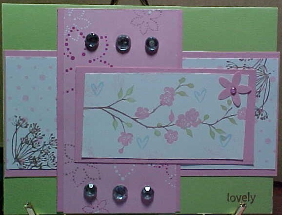
It looked like she used certain celery and pretty in pink, so those are the colors for the basis of my card. I don't have the stamps she had, so I used Berry bliss dp and just flipped the sheet over. I used close to cocoa on the flowers in the corner. for the main image I used close to coca, pretty in pink and certain celery along with the hearts in bashful blue.
I didn't have the gel spots either so I used the rhinestones.
TFL
Date: Sunday, April 6, 2008 GMT Views: 1138
Favorited:8
Registered: March 21, 2006 Location: sunny southern california Posts: 20098
Sun, Apr 06, 2008 @ 8:53 AM
Very Pretty layering and colors!
------------------------------ christine m.aka summer and weekend stalker DOT INK (My yadda yadda) Don't magnify your problem . . .Magnify your God
PROUD MEMBER OF THE REDDIVAS!
Registered: May 15, 2005 Location: Arlington, Washington Posts: 30400
Sun, Apr 06, 2008 @ 9:05 AM
how pretty is this... great colors.. and what a fun design to play with..
love your subtle changes...
the brown on the bg flowers really makes them stand out..
lovely card!
------------------------------
Judy
DT for Sassy Cheryl's Fan Club Member
" If you have a talent, use it in every which way possible. Don't hoard it. Don't dole it out like a miser. Spread it lavishly like a millionaire intent on going broke. ~Brendan Frances~