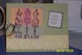
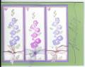
This is my submission for CC160 the color challenge requiring we use 4 colors: Creamy Caramel, Mellow Moss, Cameo Coral and Apricot Appeal. This proved to be VERY hard for me. I wasted several sheets of paper trying to find the right background for this application. I knew I wanted to do this floral for my main image, and I was comfortable with the creamy caramel and mellow moss with the apricot appeal... that that coral (which is NOT my favorite color) just didn't seem to work in no way, no how. I tried it for a frame layer, hated it. Tried it as the whole bg, threw that out. Tried not using it at all except in the flowers, but needed some of it in the bg to blend in. Sooooo, I ended up using VV and doing a negative effect CB BG with AA. Didn't like that much either, so I used blender pen to pick up just a hint of the other colors to add to the AA BG and I guess this is where I'll leave it.
Used Floral Fantasy CB folder on BG, Tiny Mosaic CB on CC, stamped swirly outline in CC on MM layer, stamped main floral design in CC and colored in with blender pens and inks for a light touch of color. Did some hand doodling around sentiment.
Thanks so much for looking at this one! I'm not at all sure about it, but then, it WAS a CHALLENGE!
What do you think?
Date: Tuesday, April 1, 2008 GMT Views: 1948
Favorited:10
Registered: March 21, 2006 Location: sunny southern california Posts: 20098
Tue, Apr 01, 2008 @ 10:11 AM
Very Pretty! I like the reversed embossing! Great use of the colors!
------------------------------ christine m.aka summer and weekend stalker DOT INK (My yadda yadda) Don't magnify your problem . . .Magnify your God
PROUD MEMBER OF THE REDDIVAS!