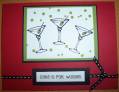
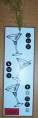
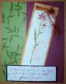
This is the second version of my martini bookmark. I used the alphabits instead of my $1 bin letters from Target. Does anyone think that the white part of the bookmark needs something extra? Is it too plain?
Date: Saturday, March 12, 2005 GMT Views: 1137
Favorited:9
Registered: June 12, 2004 Location: Missouri City, Texas Posts: 432
Sun, Mar 13, 2005 @ 5:46 AM
You can sponge the edges with an old olive to give it a real finished look. Lately, I have been doing this to alot of my cards because I think the white in general, looks too plain, as you do. It is very cute design. Great job!
I like it the way it is. I think the stark white is more representative of that "cool daddy-0" era. I like it alot. I do have a thought though, to add Crystal Effects to the liquid part of the glass.... Great job, I will definitely case this. tfs