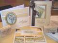
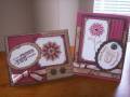
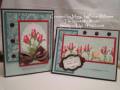
Here are my cards for the limited supply challenge LSC160. It was harder than I thought! That might be due to the bad cold I've got though. My brain just isn't working properly!
I used whisper white, soft sky and purely pomegranate for my solid colors. I believe the patterned paper is from Michael's.
Personally, I like the one on the right better. The other one is too plain, even for me!
So...which one do you like better?
Date: Friday, March 21, 2008 GMT Views: 1016
Favorited:4
Registered: June 28, 2005 Location: Sunny SW Florida Posts: 6977
Fri, Mar 21, 2008 @ 11:31 AM
These are both great cards. I like the one with the brads if I had to pick just one. The image is nicely colored and composition is great for both of them.
Registered: September 7, 2005 Location: The 5280! Posts: 10329
Fri, Mar 21, 2008 @ 11:55 AM
Great cards, but I do like the card on the right the best! Thanks for sharing!
-t
------------------------------ Tenia Nelson Thanks for the lovely comments!!
My Blog:Jazzy Paper Designs Summer 2012 CAS DT Member
Currently designing for some great companies!!!
Oh, they're both so pretty! Let's see, do I like the red on white the most, or the scallops on the bottom? I love all of the design elements, I just can't choose!
------------------------------
............................................
Hockey Mom
Registered: July 25, 2006 Location: Barrington RI Posts: 20647
Fri, Mar 21, 2008 @ 5:58 PM
lovely set of cards, but I also prefer the one on the right... I think because the small square is mounted on the pomegranate which makes the images show best. tfs!