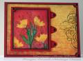
My image panel is photographing a little lighter than real life, itÂ’s a nice deep red.
-I used markers to rubber to color the flower and stamped using a positioner in case I wanted to add more color. I did a very light water mist just before stamping.
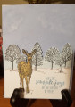
-The image was masked off using a sticky note to stamp one the small black flower silhouettes and sponge on the red; this started off as a white piece of cardstock.
-All layers but the black is lightly ink distressed.
-Tabs are the Stampin Up small oval punch cut in half.
-The red streaks on the designer paper is how it was printed, I didnÂ’t do that.
Registered: June 10, 2007 Location: BC Posts: 44872
Tue, Mar 11, 2008 @ 7:54 PM
Gorgeous main image, Roxie! I was just looking at the new grunge CHF stuff on their website.. You've done a gorgeous job with this!! Love your colours and the the 3 D look to your image. Need I say... GREAT LAYOUT!!!!
Registered: March 21, 2006 Location: sunny southern california Posts: 20098
Tue, Mar 11, 2008 @ 8:05 PM
Very Pretty! I like the offset flourish and the corners on the layers. The BG DP is perfect with your image and colors!
------------------------------ christine m.aka summer and weekend stalker DOT INK (My yadda yadda) Don't magnify your problem . . .Magnify your God
PROUD MEMBER OF THE REDDIVAS!