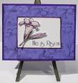
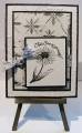
Oh I love the color combination this week, green galore, tempting turquoise and kraft. Bold brights is my favorite color family, but sometimes they can look so garish. I learned that a neutral such as kraft will very nicely tone down the bright colors I love so much, but often find too *glaring*. Thanks Emily for the lesson! ( I wonder if that will work with my wardrobe too, you can imagine the bold bright clothes that I own, teeeheehee!) Anyway, back to my card... I used my new CB paisley embossing folder and rubbed my old papper distress ink pad over it, I love how that popped the paisley texture. The focal is stamped on watercolor paper and I used a combination of green polka dots and IBB in the same old paper distress pad. My polka dot ribbon was the perfect choice and there you have it. thanks for looking!
Date: Tuesday, February 12, 2008 GMT Views: 1056
Favorited:2
Registered: March 21, 2006 Location: sunny southern california Posts: 20098
Tue, Feb 12, 2008 @ 6:53 AM
Yes, these colors are perfect for a paisely theme. Gorgeous work!
------------------------------ christine m.aka summer and weekend stalker DOT INK (My yadda yadda) Don't magnify your problem . . .Magnify your God
PROUD MEMBER OF THE REDDIVAS!