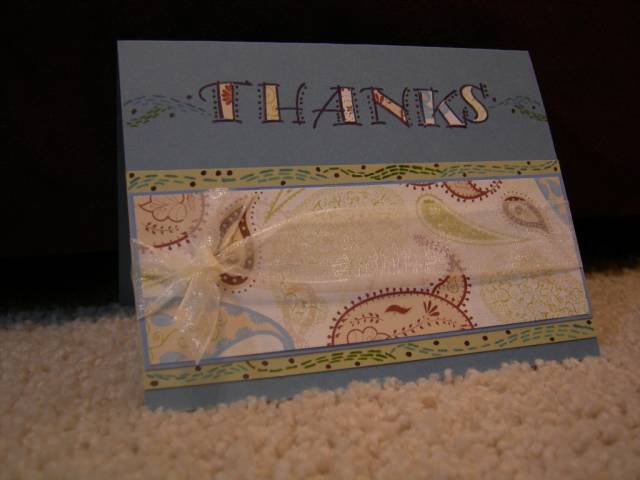
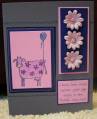
This one killed me! I knew what I wanted to do, but getting the effect I wanted was no easy task. I loved her use of dashed curves... almost Starry Night-ish, if you will. This is about the third prototype I made. So, I guess the moral is... that which looks simple my not be!
I used the Contemporary Alphabet set (since retired) and double-sided paper from Chatterbox called Courtyard Paisley. I used Brocade Blue, Chocolate Chip, and Old Olive to simulate her colors in the inspiration piece. Some Sheer Creations ribbon (on sale at Michaels) was my one embellishment.
For thiose new to challenges, here is a link to the piece that was to inspire my thank-you card. Forums at Splitcoaststampers
Truly challenging!
Date: Saturday, January 26, 2008 GMT Views: 547
Favorited:3