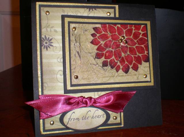
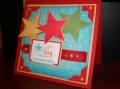
I did not start out thinking this card would become a part of the More Is More challenge, but after looking at my first card.....I finally just did not feel good about it....something was missing. I took it apart and started adding. I changed just a few things....gold embossed look (gold encore w/ clear ep) with brads. I added a few more layers, took away the basic gray, and added a black background. Now, I think this more is better. Of course, I would like to know what you think....is More....More?
Registered: June 29, 2004 Location: Sugar Land. Texas Posts: 79456
Tue, Oct 30, 2007 @ 8:35 PM
Beautiful card.
------------------------------ LizThe joy of the LORD is my strength.Right Brain Madness --My blogProud member of the redDivasKSS certified multi-step stamperFan Club member since 2004
Registered: April 16, 2005 Location: Walla Walla, WA Posts: 15082
Tue, Oct 30, 2007 @ 8:52 PM
They're both beautiful, but you're right . . . this one is MORE. It's more dramatic and more eye-catching. I love the black, gold, and pomegranate. Wow!